What’s on My iPhone COVID-19 Edition
2020-05-31 17:13:52
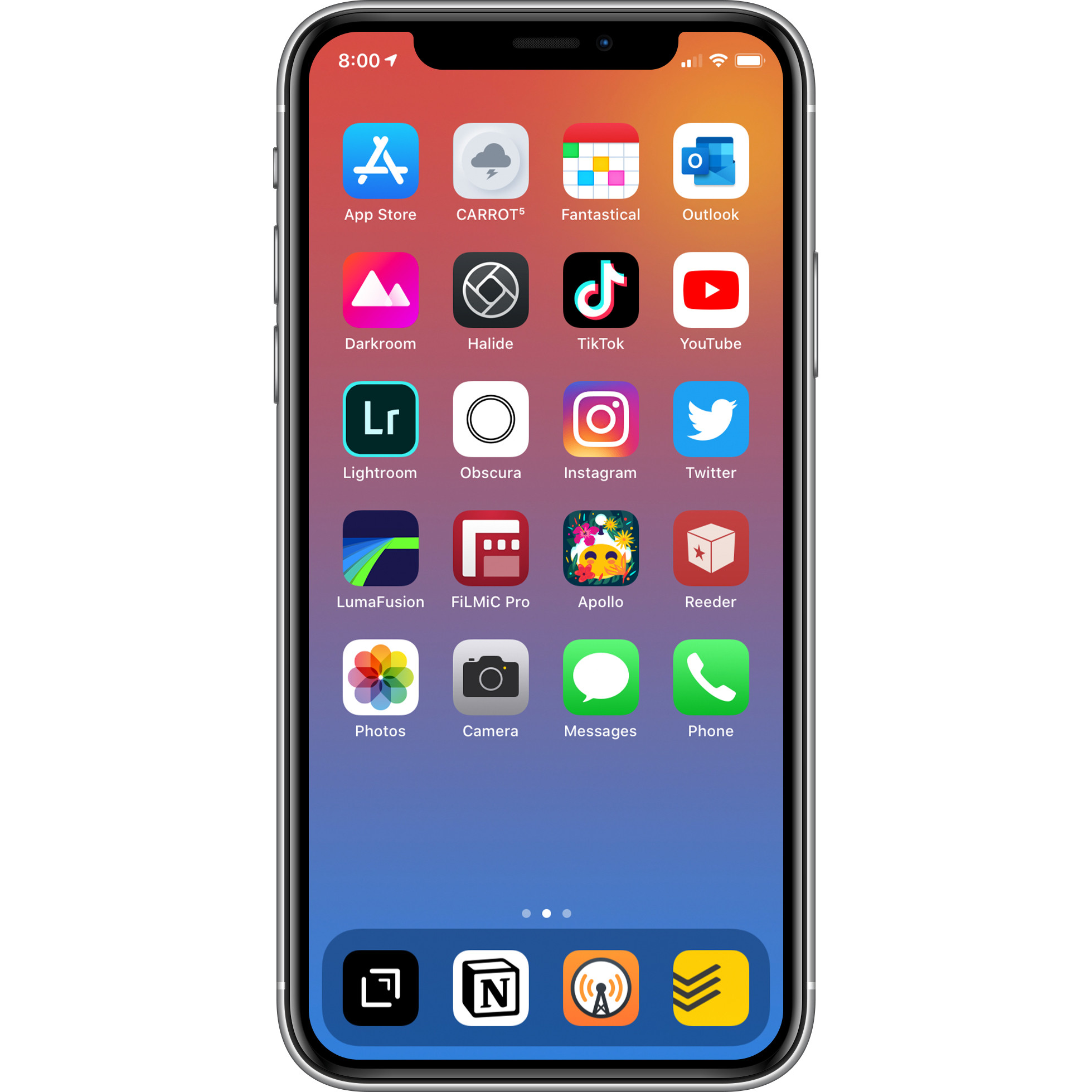
COVID-19 Quarantine caused me to rethink the layout of my home screens on my phone. I’ve posted before about them, but they’re way different now. My mindset back then was focused on utility and a little aesthetic (even though a lot was going on). I wanted them to be easily accessible for one handed use. This accessibility does still matter, just not nearly as much right now. I decided I wanted my screens to accommodate how I’ve been using my phone while being at home literally all the time. Let me layout what’s going on and why they are the way that they are.
I first decided I wanted a two screen setup. I had a one screen setup before, and that was working well; but I wanted a simpler first screen. Like most people, I’ve been using my phone for entertainment or an escape from the bad that’s been happening right now; but I’ve also been trying to use it to capture and create. I wanted my first screen’s focus to be a mix of the apps I use for those purposes and a few of the apps I use the most.
The top row includes my most used 4 apps that don’t fit in to the mentioned uses. The eight apps to the left are the ones I use for capture and creation. The eight apps to the right are the ones I use for some kind of entertainment. Those include the social media, communication, and consumption apps I frequently use. Here’s where my lessened want of one handed accessibility comes into play. I used to add blank icons or just other apps or folders to the top rows to push down the apps I wanted closer to the dock, but I’m not doing that. I’m just simply putting them closer to the bottom without the filler rows.
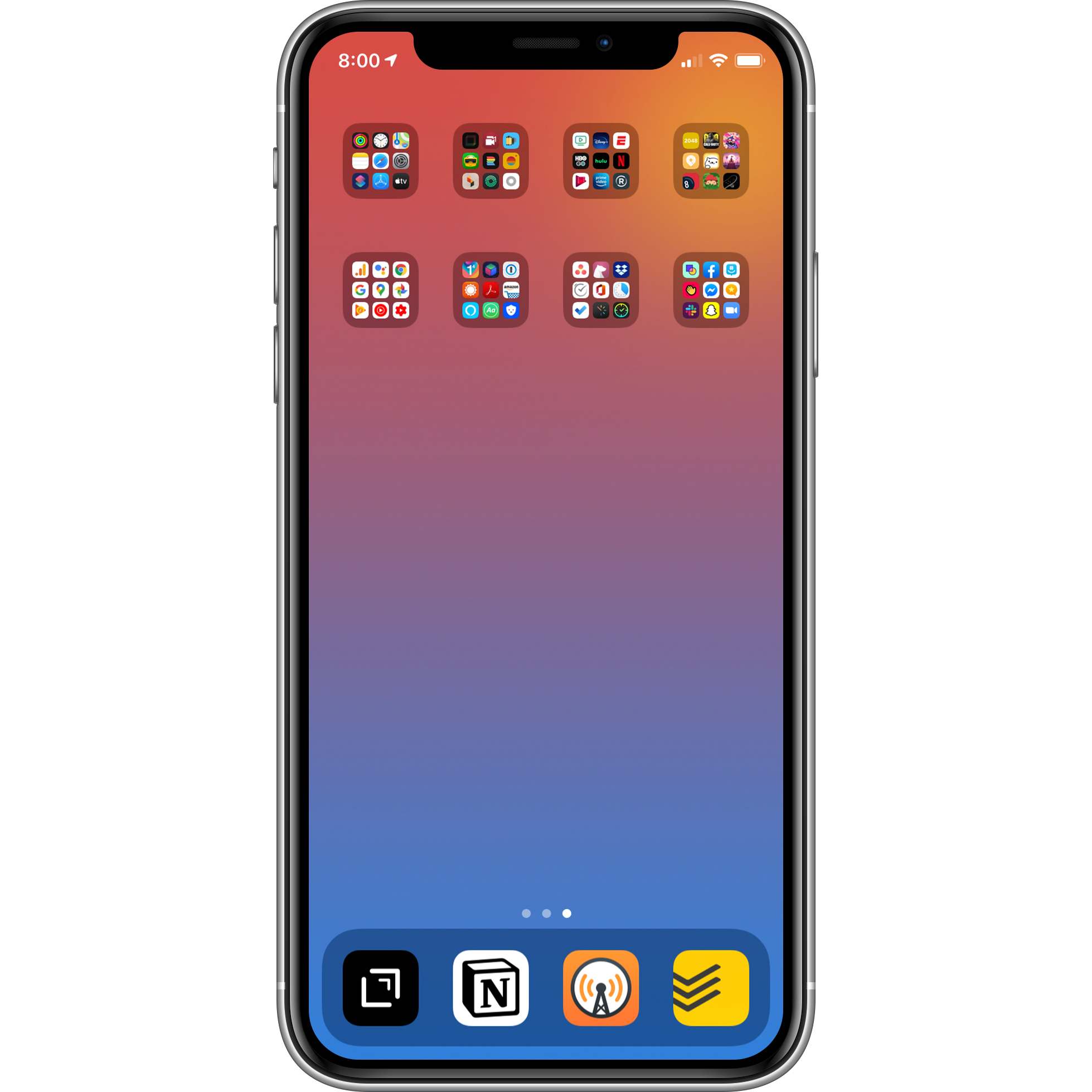
The second page just has all the rest of my apps categorized into only 8 folders unlike the 70 folders I used to have (that was so dumb). I’m not going to get into those, but I think they’re pretty self explanatory. I used to have folders filling up the screen, but that’s way too many. No one should have that many folders with only 2 apps in each folder. Having these 8 folders just makes the second screen more minimalistic. I can find apps if I really want them, or I can just search for them. This will also help me figure out what apps I straight up don’t use. I have the setting that offloads an app’s data if you don’t use it. If that’s the case I’ll just delete the app if I really don’t use it/really won’t ever use it again in the future (#minimalism).
The dock has the apps I always want easy access to no matter what screen I’m on: Drafts, Notion, Overcast, and Todoist. Drafts, Notion, and Todoist help me live my life. Drafts is where I can write literally anything and everything down. Notion is where I organize different aspects of my life. Todoist is my task manager. Overcast is my podcast player. After this doodoo situation is over, I definitely plan on rearranging my screens again, but these four apps will stay here. They have the biggest impact on my daily life.
That’s my current COVID-19 Quarantine layout. Changing things up on your phone can almost (not really) make it feel like new. I hope this post either helps you organize your home screen(s) or provide some kind of entertainment.
Note: I made a new wallpaper if you care to download. It’s also based on my blog’s colors.
