My iPhone Home Screens
2018-03-07 04:12:05
Full Disclosure: I started writing this post on December 28, 2017, and since then I’ve constantly been making changes to my screens. That’s one of the reasons why this article has taken me so long to write. Plus the amount of detail I originally wanted to go into about my decisions really made me procrastinate. I really do love just thinking about how my brain works and how best my phone can suit its needs while achieving a great functional aesthetic.
Missing It
I used to be a hardcore Nexus user. I thought Android was better in every way compared to iOS. I thought the hardware and software were better. I never thought I’d have an iPhone in my life, but here we are. I still love Android, but iOS is really awesome. There is one thing that I miss though: home screen customization.
When I started using my first iPhone, I immediately made myself get used to not being able to put icons literally exactly where I wanted. I accepted widgets only existing on one page. I knew iOS wasn’t capable of this level of personalization, so I told myself these things in order to make the transition easier. I know I’m over-dramatizing this; but as a person coming from using a certain OS for 6 years, the little things matter. This was a feature that I did not take for granted. Now that I don’t have this granularity, I really miss it. I’ve tried setting my screens up in creative ways before with folders and different numbers of screens, but nothing made me feel close to the excitement I had when customizing my Android screens. However, I think I’ve finally come as close as I’m going to get.
The Resources
I want to talk about how I’ve gotten my screens to look the way they do. I use a certain wallpaper and block of text. The wallpaper hides the dock and folder backgrounds. The block of text hides the folder names. I don’t remember exactly how I found both of these things out, but I’ve included links in case someone is interested in taking the same approach to their screens. I also use an app called Workflow for dummy white app icons. They blend in with the white background.
Functional Aesthetic
I wanted my home screens to be extremely functional. I listen to a lot of tech podcasts, and some of my favorite topics are the apps people use and their own home screen layouts. I love drawing inspiration from these conversations to see if I can improve on anything I’m doing. I always want to make sure that the layout I’ve chosen is best for me.
The fact that I’m right-handed played a lot into my decisions. I thought about thumb reachability because that’s the finger I touch my screen with the most. I wanted certain apps to be within reach without too much stretching. I also took into consideration the number of touches/swipes it would take to open an app.
I paired this thinking with the desire to have some nice looking screens. I’ve gone through so many iterations of this approach, and I’ve come to my favorite one so far. My phone is my most used device, and these extreme details matter a lot to me. My thoughts are that I can’t think enough about the device I use the most and how I use it. I can’t think enough about how it can be a better tool for me.
Folder Structure
I have more apps on my phone than anyone I know. My thinking for having so many is that, “Maybe one day I’ll need this.” Sometimes I think to myself that I should be a minimalist and only have what I need, but I can’t get past the feeling I stated earlier. I decided to separate all my apps into folders. I’ve installed so many that I can’t remember everything I have, so I figured creating specific folders was the best solution. I thought searching for the app wouldn’t be too productive since I wouldn’t even know what to search for. This way I’d be able to look through these folders for a certain type of app, and I’d probably have it.
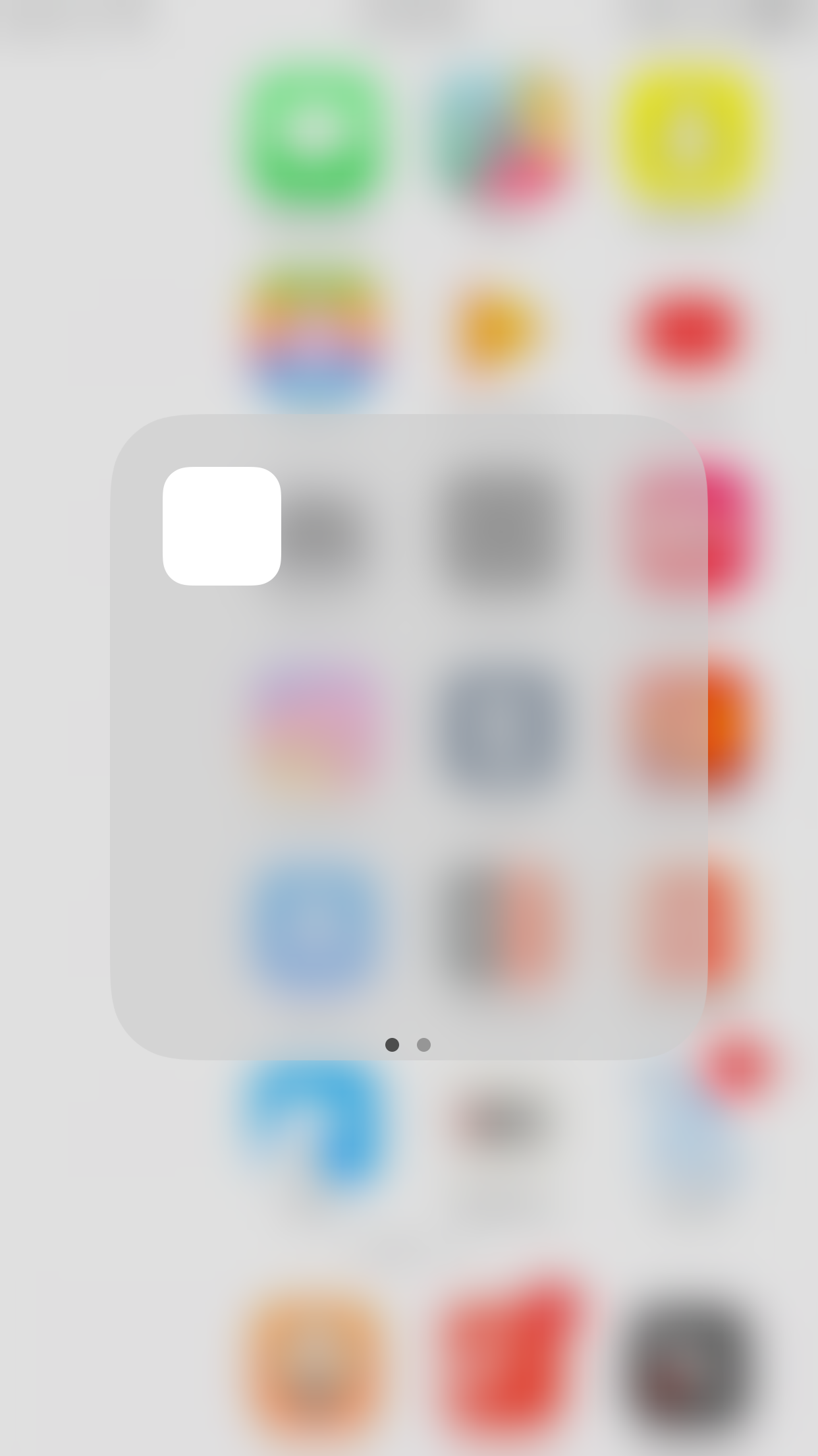
The apps I chose to keep in the first page of the folders were subjective. Some I deemed more important, but others I just took the first 2 alphabetically. On pages 1 and 2, I put a dummy icon in the first page of the folders on the left to make that column “invisible.” I just like this look a lot.
Page Count
Page count matters a lot to me. Several of my iterations had one or two pages. I never liked having too many. For this setup though I changed my thinking. I’ve put certain apps on certain pages, and it’s working out very well so far. I’m going to go through my pages least important to most important.
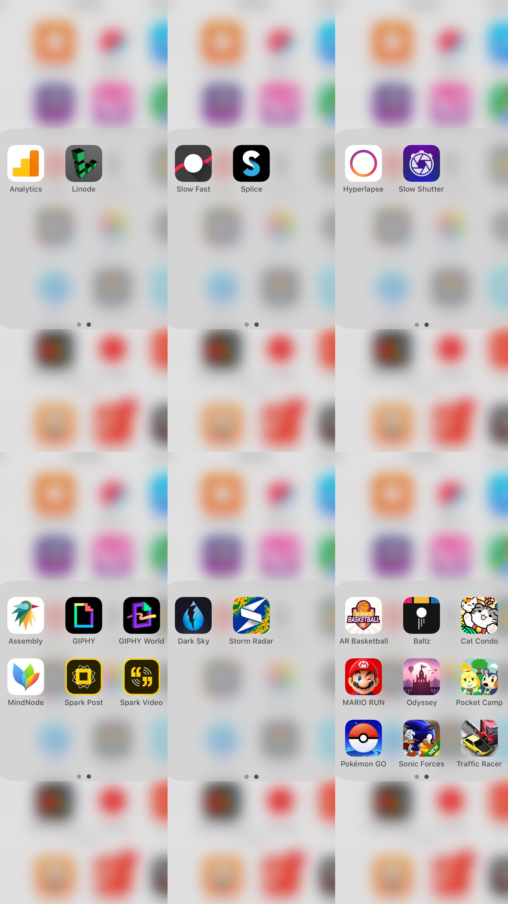
Page 3
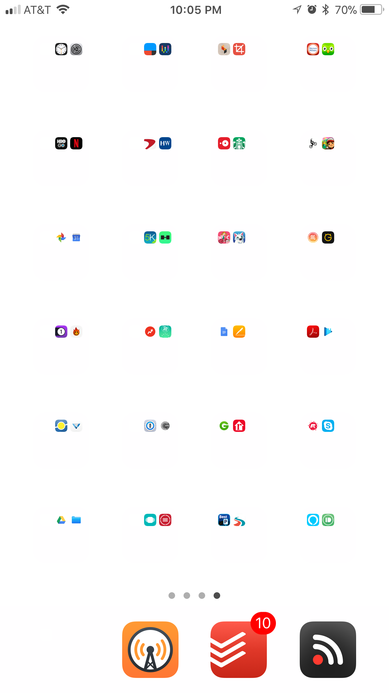
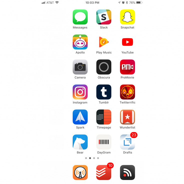
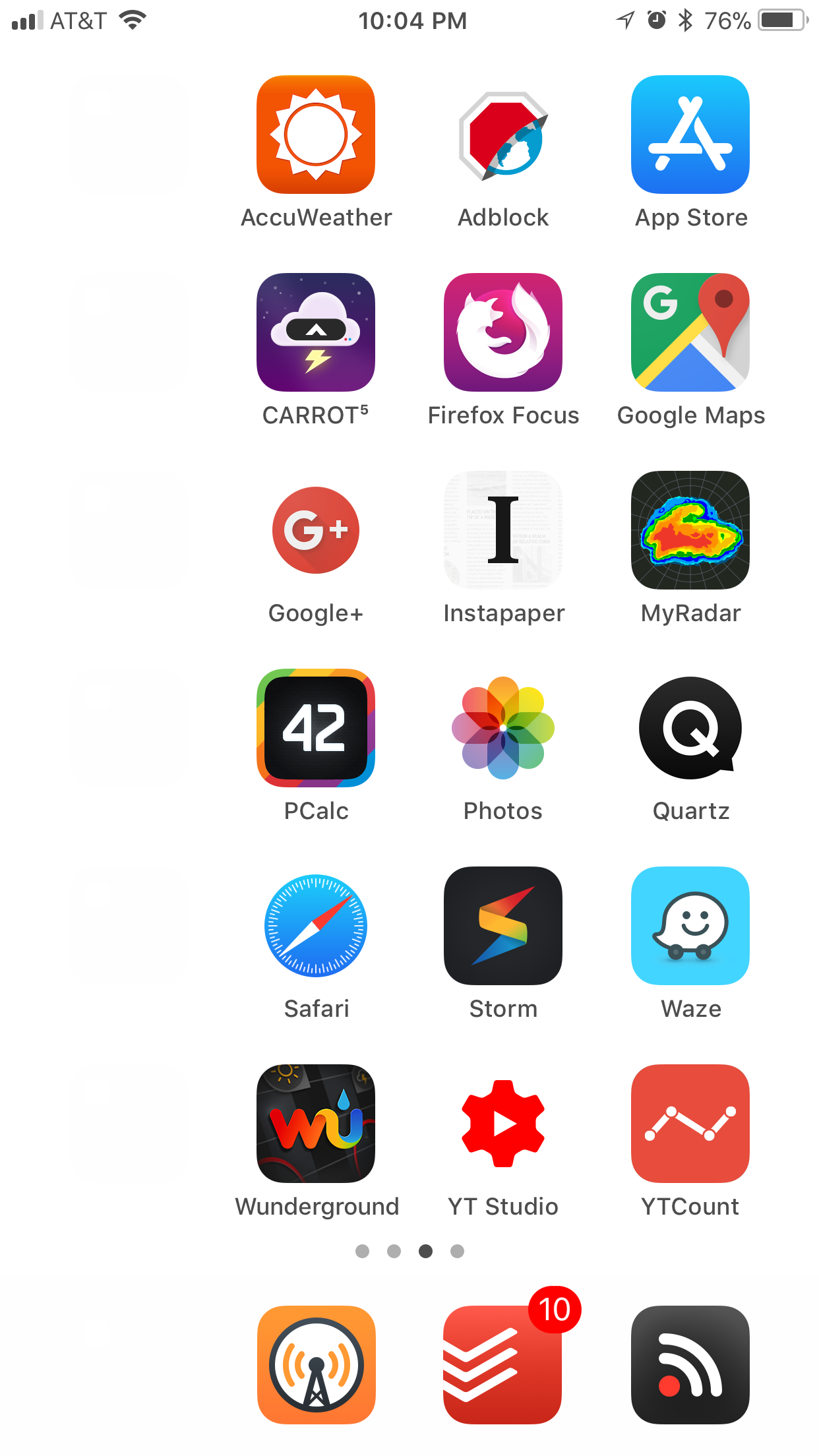
My last page is full of apps I don’t use too often or apps I really don’t want on my first 2 pages. I also put apps there I don’t want to be tempted to use too often like Netflix and HBO Go. I just put them into folders as stated before to further my aesthetic. I recently put the dummy app in the first position in each of the folders in the first two columns. I did this to make this last page more symmetrical.
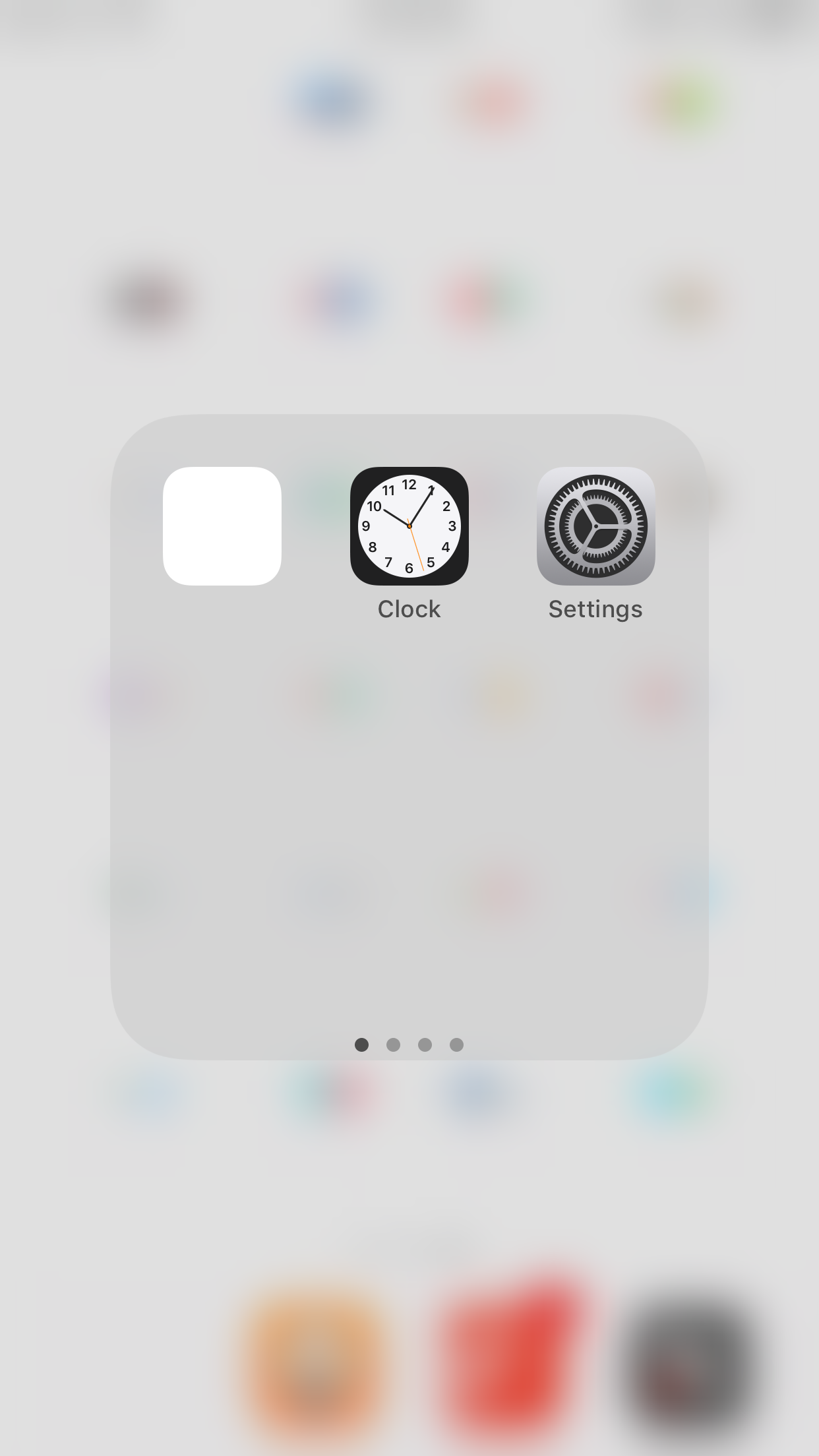
I wanted to have a uniform number of icons displayed in the folders. CGP Grey inspired this with his one icon in his folders. I wanted something clean as well; I just wanted more than 1 icon. I would have preferred to have 3, but some of my folders only had 2 apps in them. As I mentioned earlier I’ve categorized the apps pretty specifically so I could find what I was looking for. I understand that I don’t have any folder labels, so it must be hard to tell what folder contains what apps. The apps displayed in the first pages convey the type of apps each folder contains. That paired with already being used to these folders makes finding my apps easy.
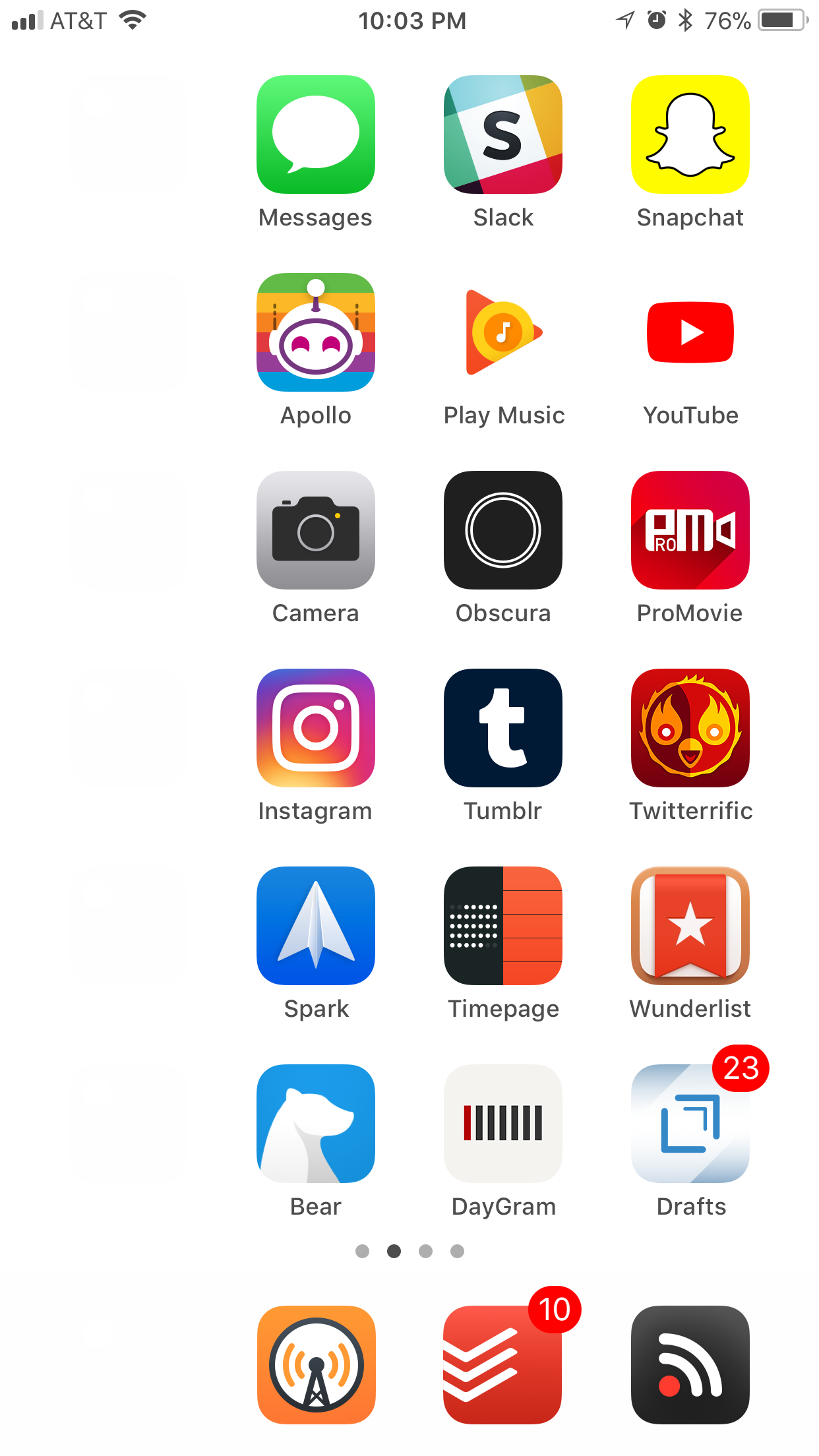
Page 2
The second page has apps I like to use a lot, but not as often as the ones on the first page. I kept the apps I use the most on this page out of folders and arranged them alphabetically. The folders are arranged alphabetically according to category. The way I’ve categorized these folders is admittedly weird and arbitrary, but it’s the best way I came up with for myself. These self-explanatory categories fit into this sentence, “I use these apps for …”
Page 2 Categories
- Administering to my website
- Altering videos
- Capturing photos
- Constructing media
- Forecasting the weather
- Gaming
I decided to have a second “main” page because I use too many apps that I don’t want in folders to keep on just 1 page. I tried and tried to narrow them down, but having these apps on two pages is the best I can do.
Page 1
Page 1 is laid out almost exactly the same way. There are again categories for folders that fill in the same sentence above. However, the apps that aren't in folders aren't only arranged alphabetically. Each row is part of the same category. Those categories are alphabetized. If you can't tell I like alphabetization. I realize I could just memorize where all my apps are after continued use, but alphabetization offers just that little bit of extra help with locating them.
Page 1 Categories
- Communicating with others
- Consuming content
- Creating content
- Networking (socially lol)
- Producing results
- Writing things down
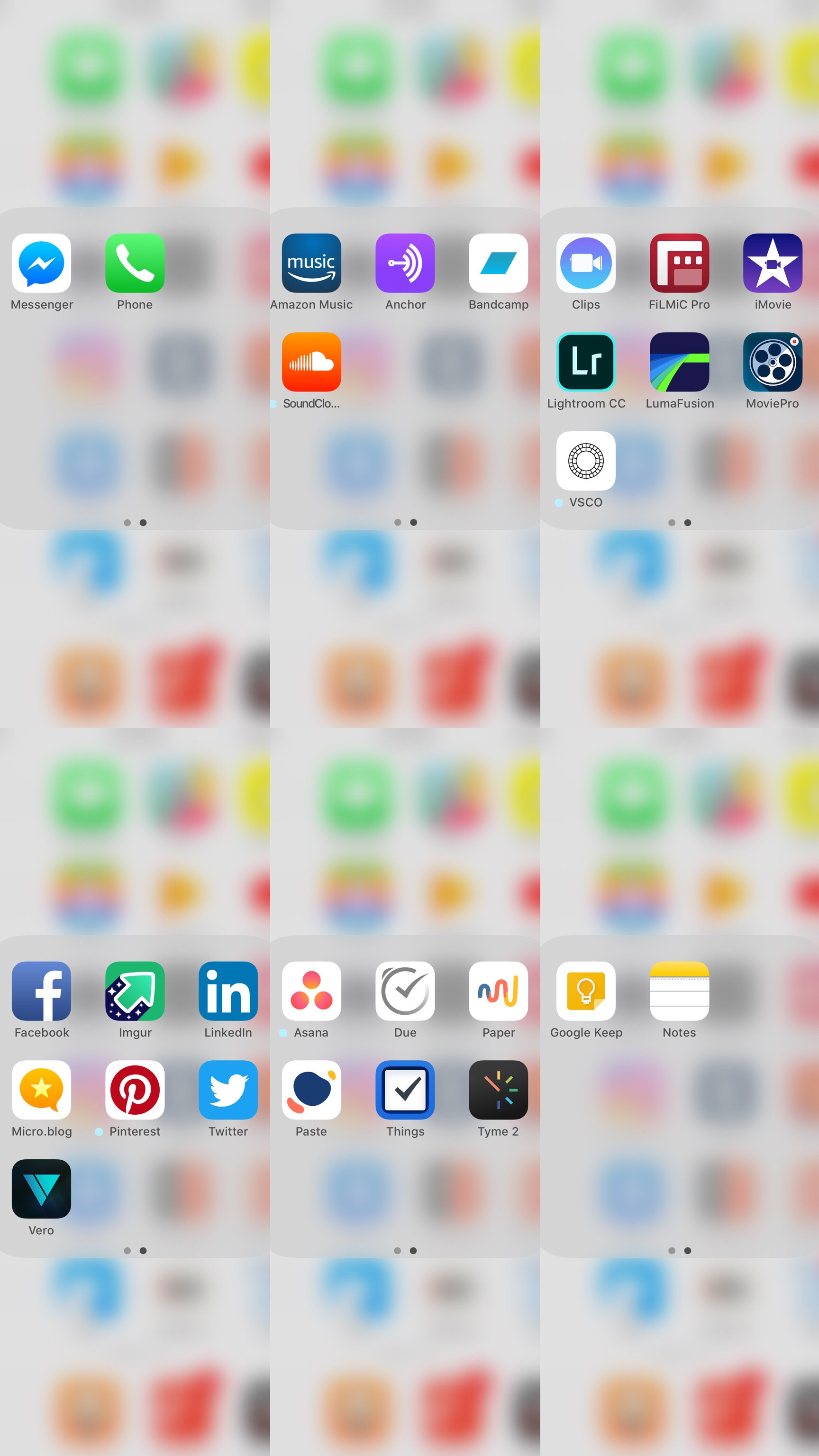
The apps on this page are the apps I use the absolute most or are the most important to me. The ones not in folders are the highest degree of these aspects. The apps on this page have influence in the biggest parts of my life. That’s why I’ve chosen them to live here.
The Dock

The folder in my dock contains Google Chrome, DuckDuckGo, and Google Search. It’s on the left to line up with the other folders. Next is Overcast. This is my podcast player of choice. I use this app every single day, almost all day long. It may just be my most used app on my phone other than the next app Todoist. This is my task manager. I recently just had a quick stint with Things 3, but I’ve discovered that Todoist is what I really need. This is how I remember to actually do things and plan things out. Unread is my RSS reader, and it’s in the dock because I’m trying to make a conscious effort to stay more informed about politics, society, and technology.
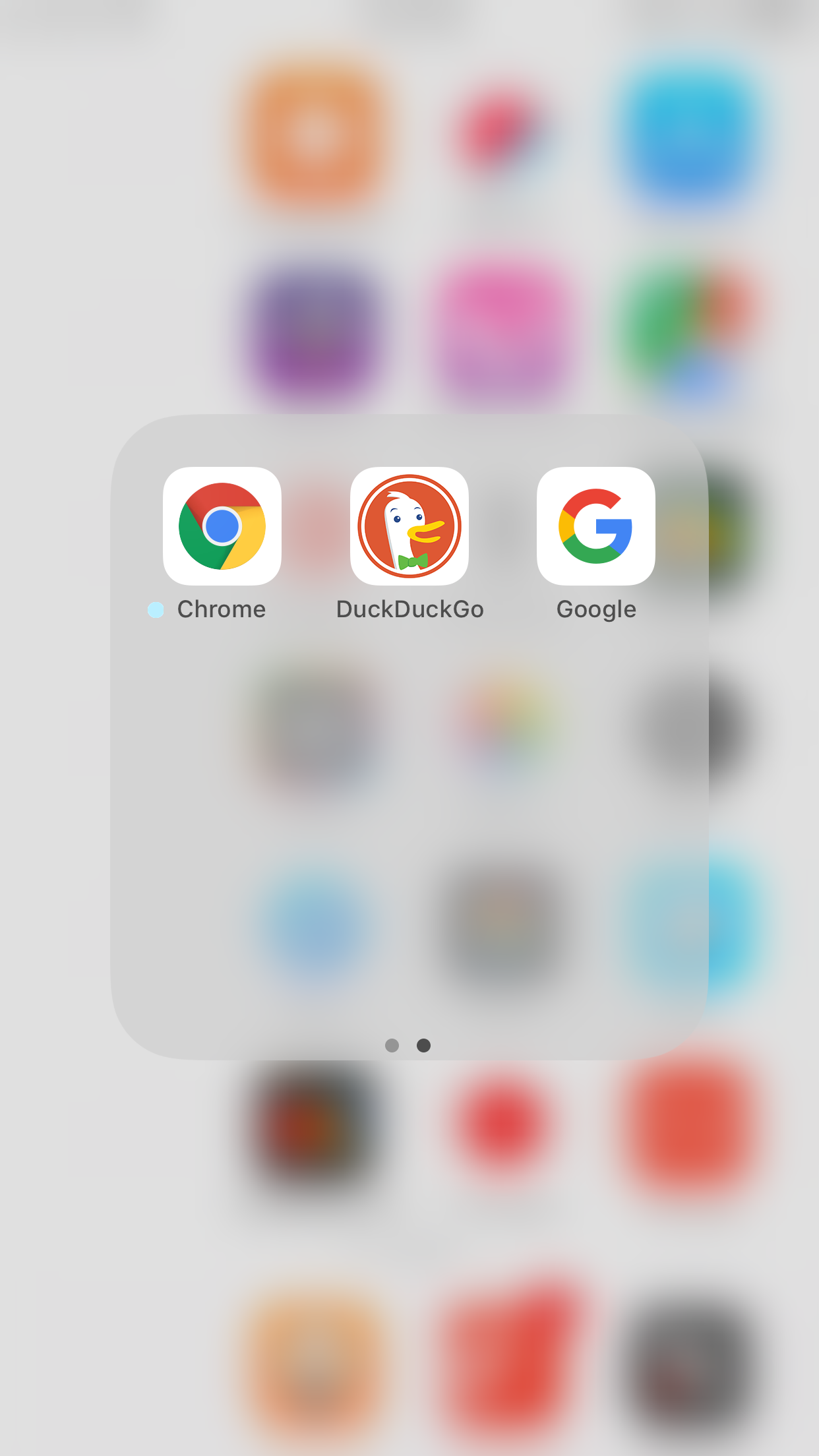
What apps I decide get to live in the dock is what I give the most thought to during this whole setup process. I think about how quickly do I want to be able to access them, how often do I use them, and how much I want them visible. I gave an incredible amount of consideration to these ideas, and I’ve ended up with this dock setup.
Closing Thoughts
I could say more about my setup and go into even more specifics, but this is the gist of my reasoning for this setup. I’m really enjoying how it’s working out for me, but I know eventually things will change. No matter what I change whenever that may be, I just want it to work best for me.