Todoist: My Task Manager
2019-04-14 09:31:56
I’m an extremely small-scale influencer (not really)! My brother recently asked me about task managers. I suggested the one I’ve been using for a couple of years now, Todoist, and a few other apps. My argument for Todoist put him over the $36 yearly subscription edge. He’s been using it for 2 months now, and he loves it! He says it’s been a lifesaver. It really is a great way to help you organize your life and accomplish tasks. I’ve tried several task managers and notes apps to help me get things done, but I’ve always come back to Todoist.
DISCLAIMER: I will only be talking about my experience with the fully paid version of Todoist.
My Productive History
I’ve tried writing this article a few times over the past 2 years. My first attempt was in January 2017 when I first started using Todoist. Then I tried again last summer. I had just stopped using Todoist, and I replaced it with Things 3, CARROT, and MinimaList. My idea for having 3 apps was to split up certain kinds of tasks into each app. Things 3 was for larger projects that had hierarchies. CARROT was for quick tasks. MinimaList was for recurring tasks. Trying to keep up this conscious compartmentalization got old real quick. After that brief stint with other Things (lol), I returned to Todoist and have been using it ever since.
Features
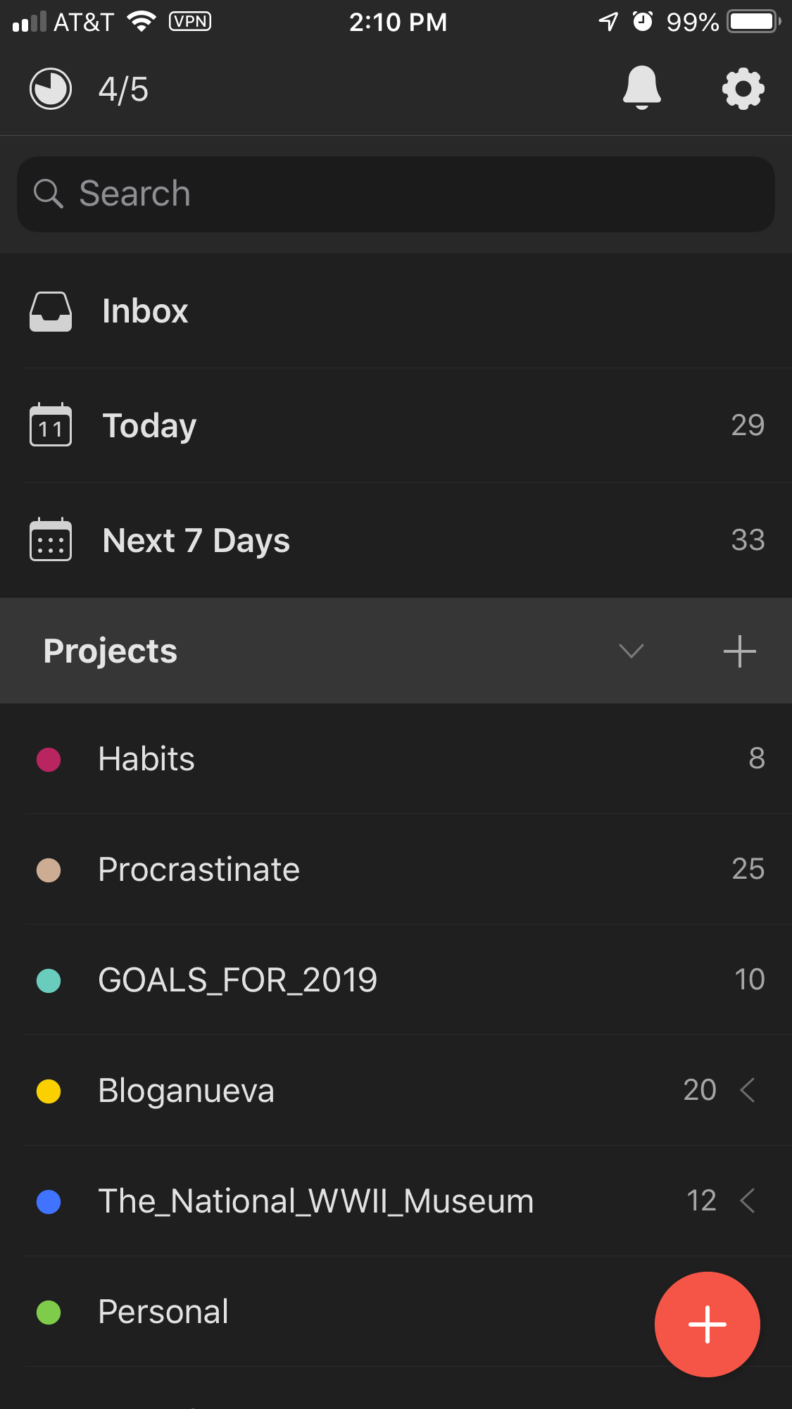
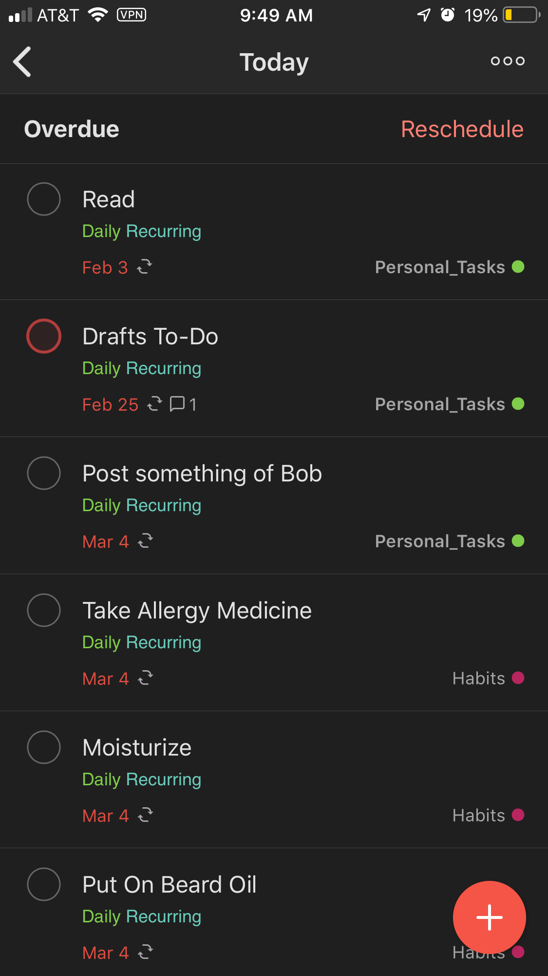
Todoist is incredibly flexible. It’s as robust as you want it to be. You can have so many projects. You can create filters based on project(s), time(s), or label(s). It can also be as simple as possible. If you really wanted, you could just input all your tasks into the Inbox. However, I’ve found out this approach doesn’t work for me. My Inbox would be so full that I would feel overwhelmed with things I have to do that I would just do nothing. Now upon task entry I give everything at least a project and more often than not a time. Using this approach means I don’t need to go in later and sort everything in my Inbox into their appropriate projects.
Natural Language & Symbol Recognition
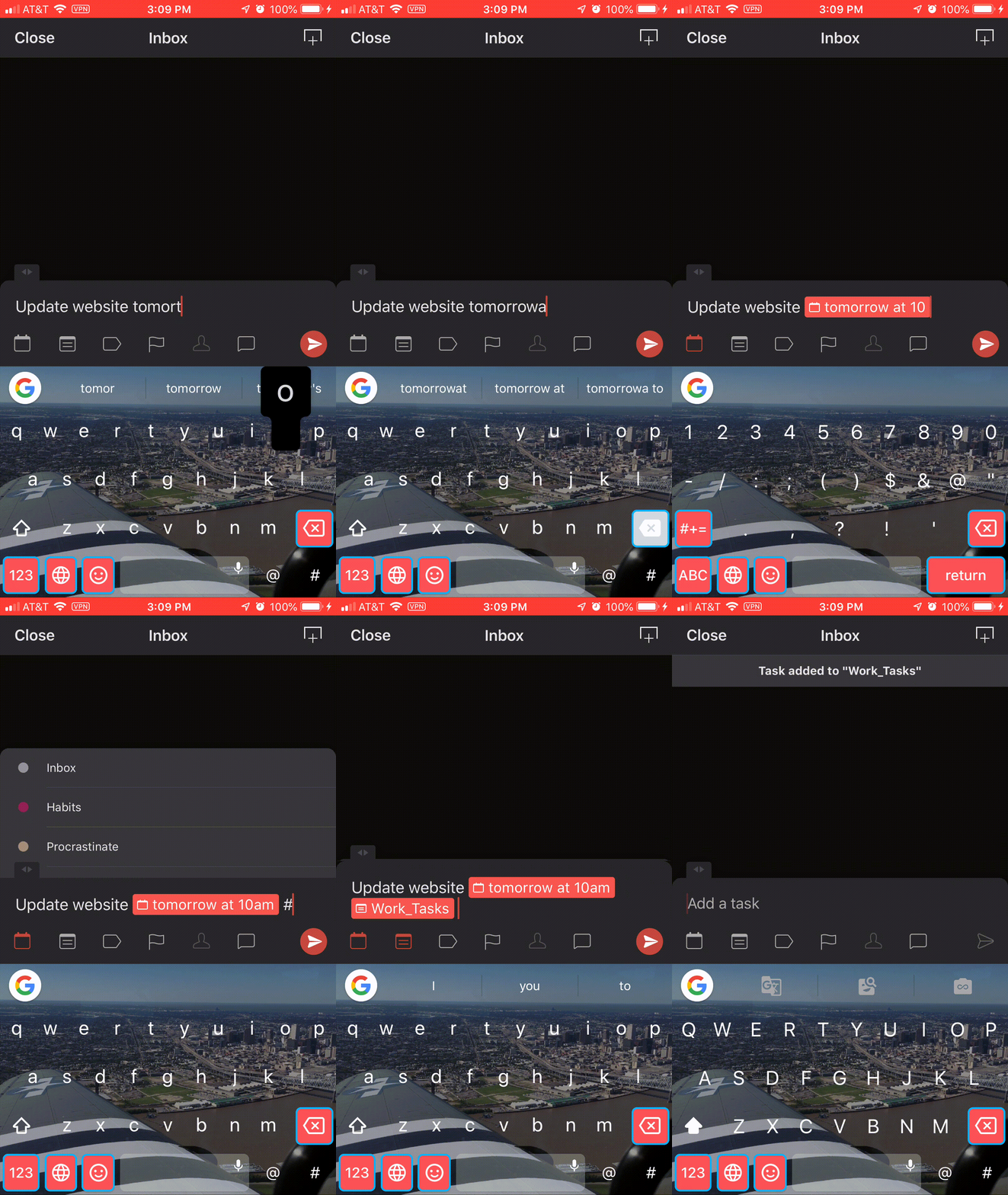
This combination of features is almost the sole reason Todoist is my favorite task manager. I love only needing to type in what I’m thinking in my head and not needing to go through configuration steps when creating each task. All I have to do is type Update website tomorrow at 10am #Work_Tasks, and the task will be entered with a due time at 10 a.m. tomorrow and will be added to my Work_Tasks project. It is so convenient and intuitive to do it this way. I canNOT use task managers that don’t do this, which is basically all of them (I haven’t found another one that does this). I do not like needing to click extra buttons to enter times or choose projects or labels. It’s so much quicker to input everything in the same field. I like this feature so much that I use Fantastical 2, a calendar app, because it also offers this feature.
Organization
Like I stated above, I immediately put a task into a project. This is just scratching the surface of organizing everything. Todoist lets you do so much more to help keep your ideas, thoughts, and reminders neat and tidy.
Nesting
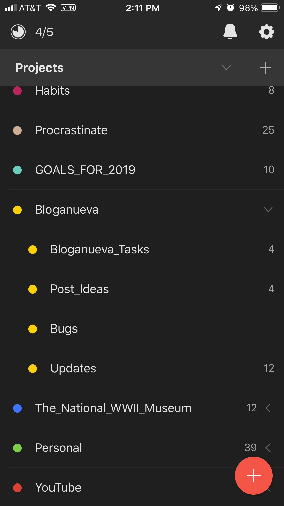
You can nest projects under each other. This enables me to categorize my tasks more granularly and keep my projects list from getting too long. A project with subprojects becomes a dropdown on the left sidebar. This collapsibility helps me with information saturation on the screen and keeps my anxiety at bay.
Headers
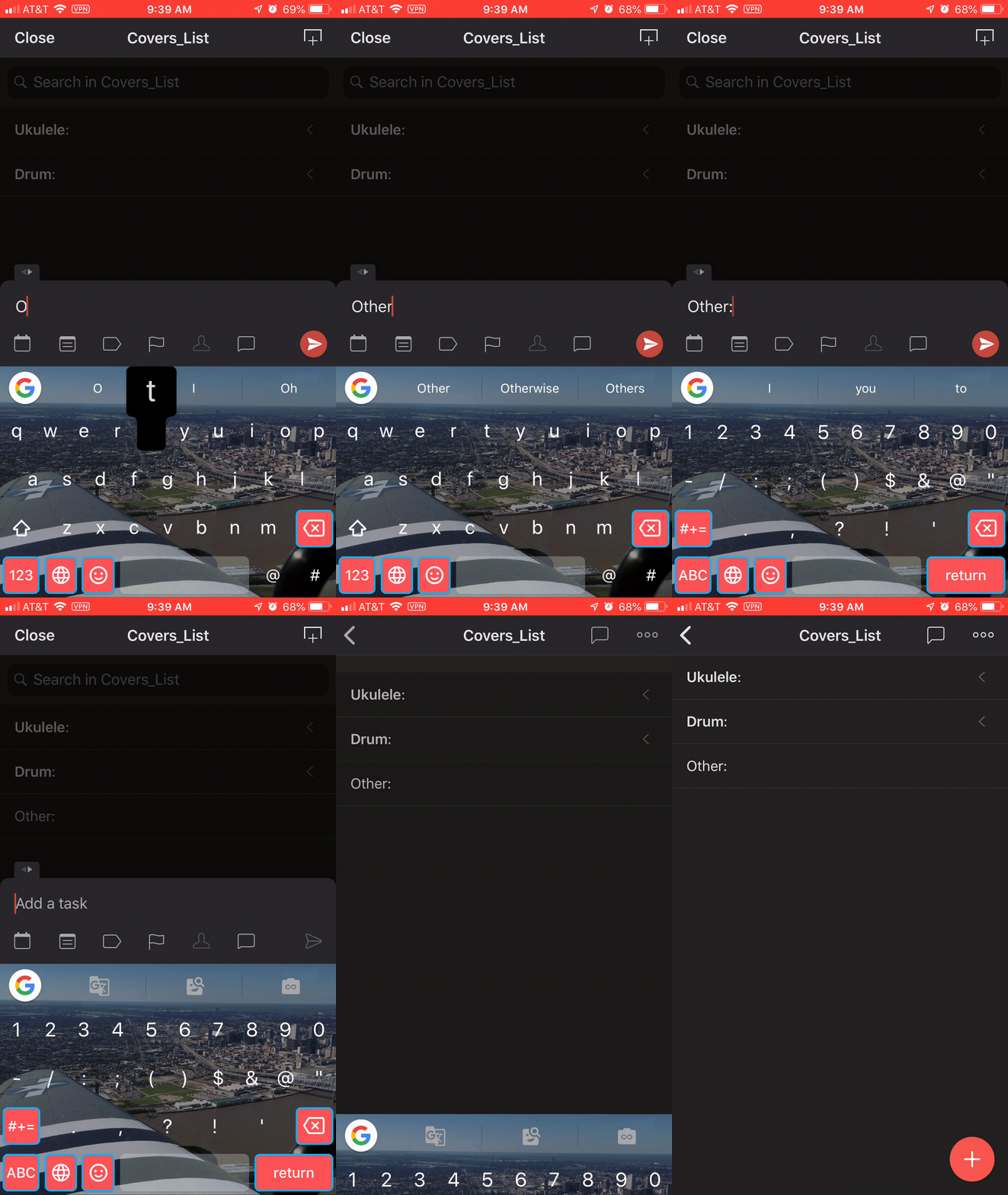
When you create a task within a project, you can turn it into a header by ending the name with a colon. You can then create subtasks to nest under this header task. The header, like projects when nested, functions as a dropdown to help keep your list nice and clean. It helps you organize your tasks even more without needing to create another project.
Labels
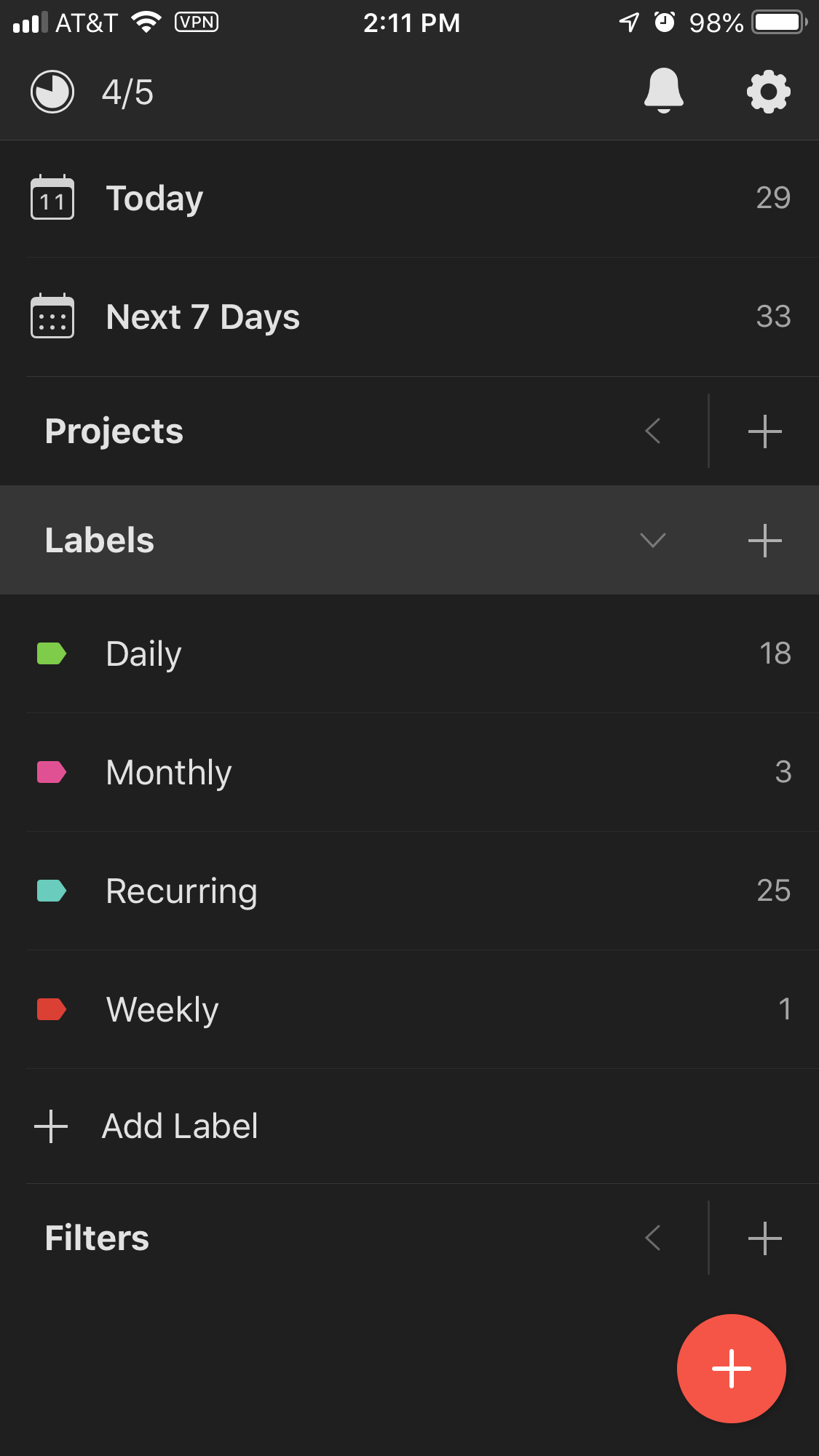
Labels are yet another way to categorize your tasks. It’s not a project; it’s more of a tag. You can attach different labels to tasks in the same project if you’d like. It provides more granularity.
Filters
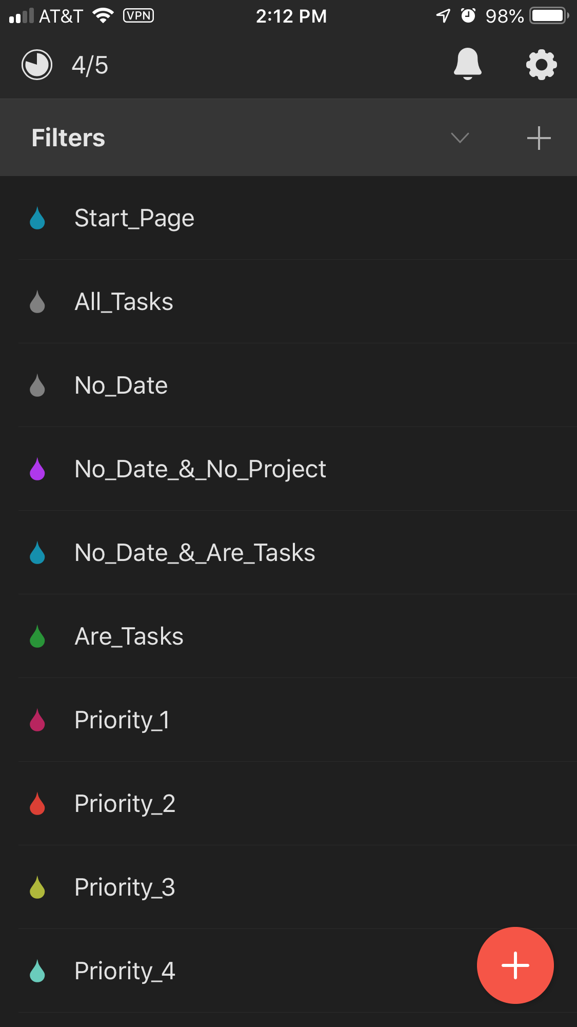
Filters are queries you can put together to get certain tasks based on projects, labels, due dates, etc. It enables you to see a more specific task feed, if you will. For example, I have a filter that displays literally all of my tasks. I have another one that displays tasks that don’t have due dates. Filters are very powerful.
Tracking
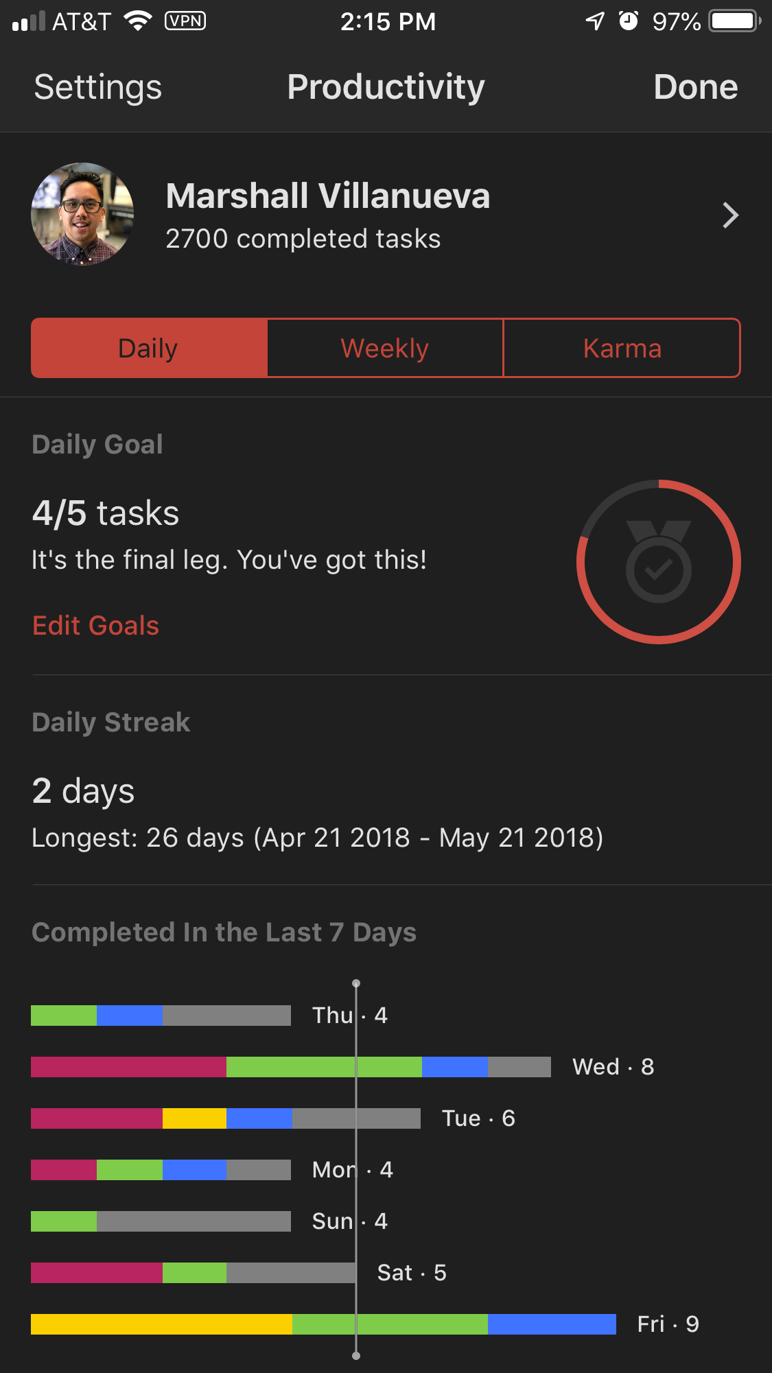
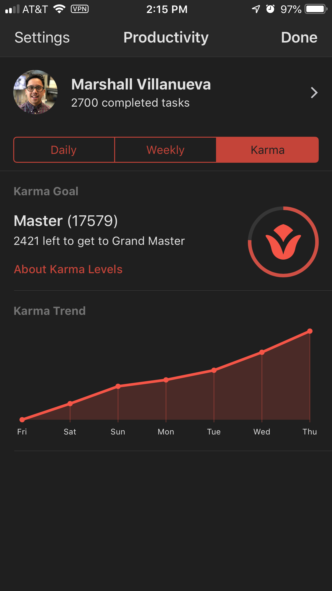
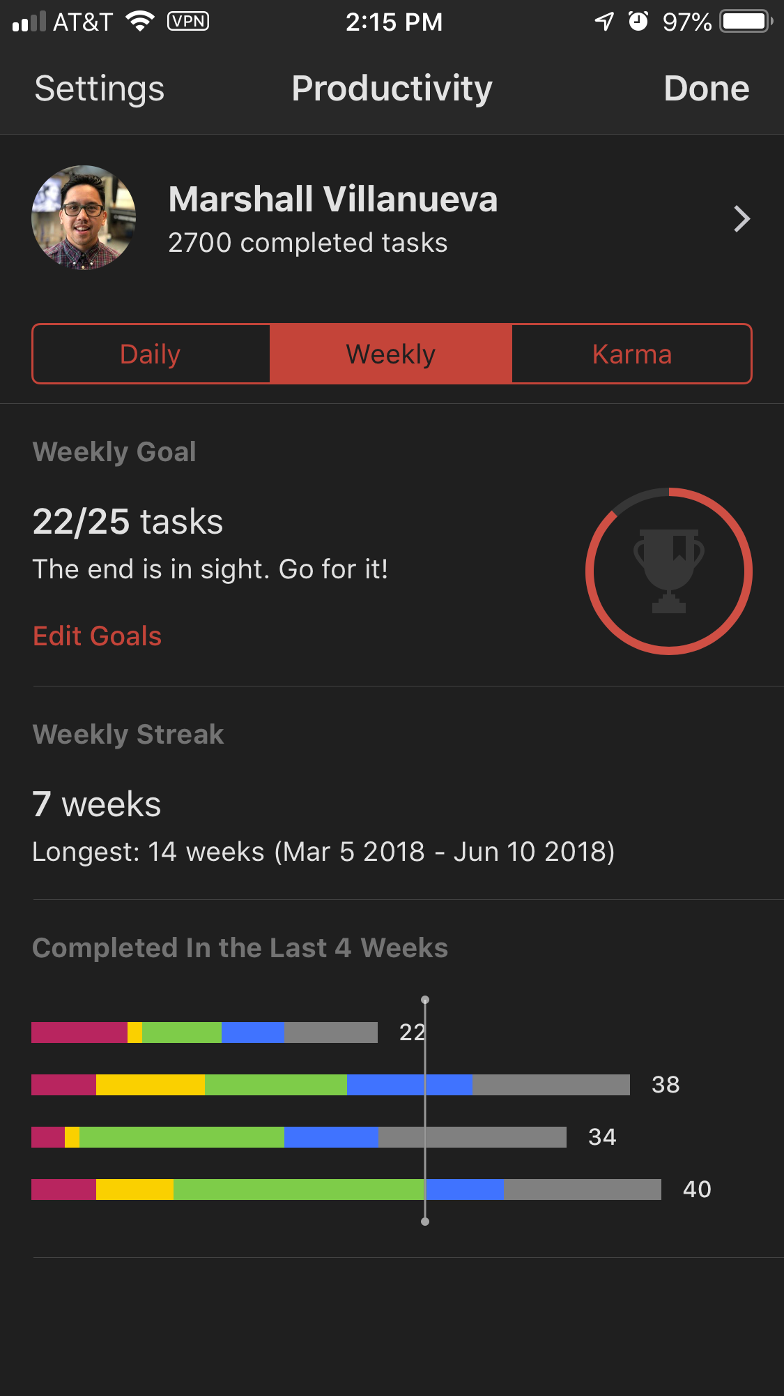
Todoist offers great tracking of tasks via Karma and Activity. Both have great looking graphics to see how you trend over time. It’s a nice touch if you like being able to visualize progress.
Karma
Karma is a great way to gain personal recognition that you’re accomplishing your tasks. You gain Karma points when you complete tasks or add tasks. You lose points if you have tasks that are overdue 4 days. You can set a daily and weekly task quotas (mine are 5 and 25), and if you reach it you get bonus Karma. Gaining Karna doesn’t matter to me that much, but it is nice to see my points increase over time.
Activity
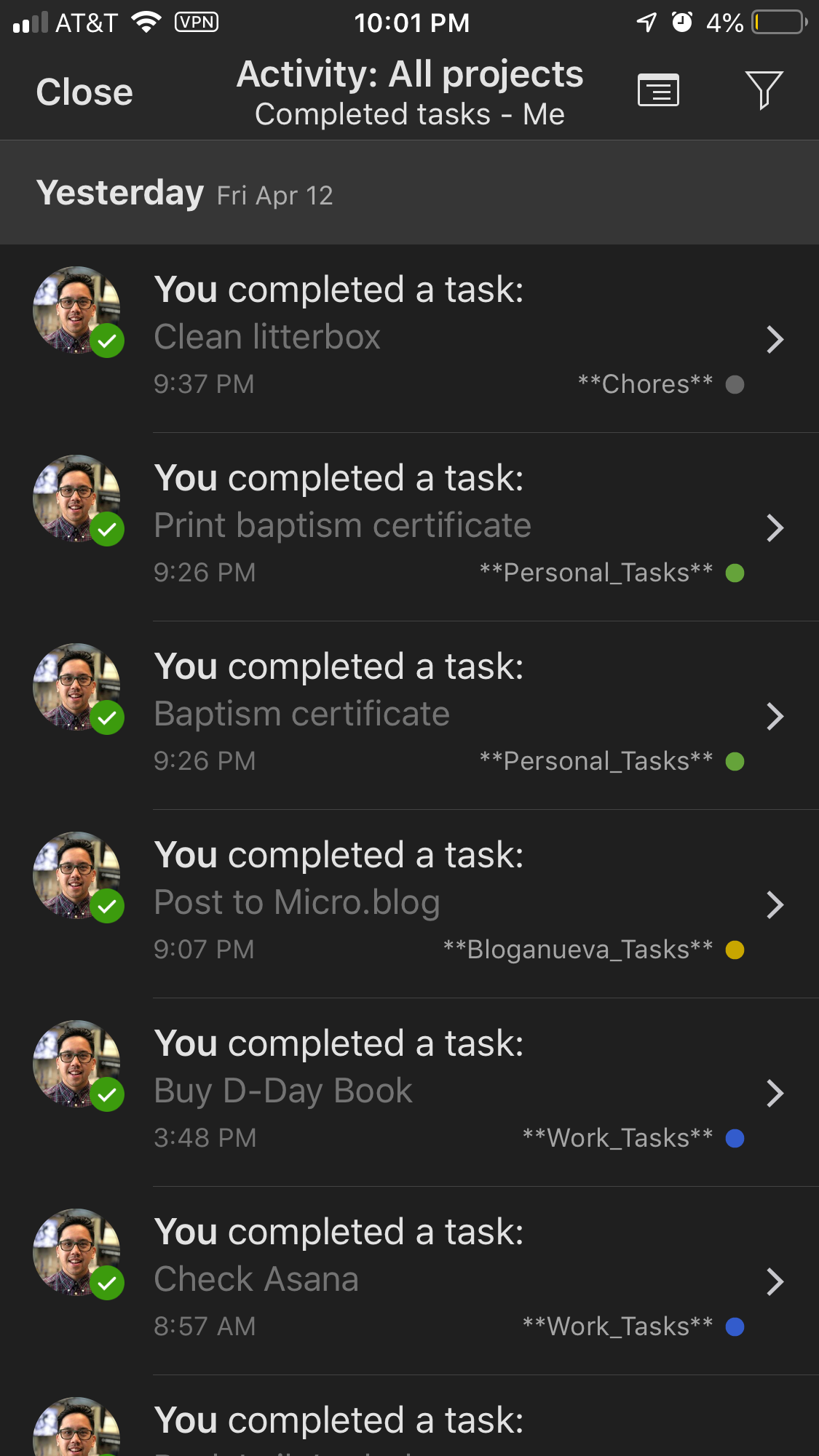
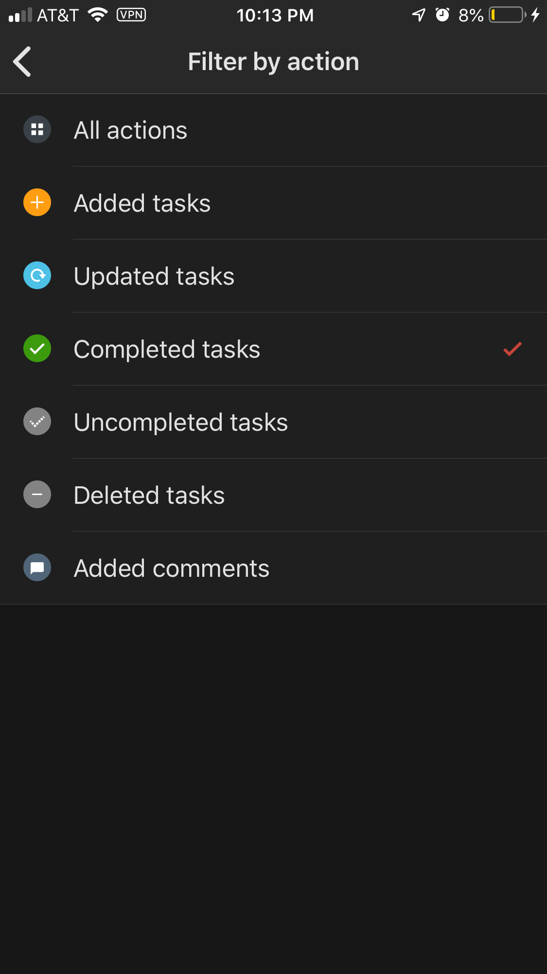
Todoist keeps track of everything you do. Ever. It’s really nice to see how many tasks you’ve completed or added. It also helps to see when you complete something if needed. Activity is filterable by pretty much anything you want–project or action. It’s really powerful way to dive deeper in to everything you have ever done.
Formatting & Customization
If you like your text to look different sometimes, Todoist has your back. You can bold and italicize projects and tasks. You can add links as well. I personally don’t add too many links, but I do bold some items just to help them stand out more.
I’ve picked certain colors for projects based on what they’re associated with or how I feel about them. For example, I work at The National WWII Museum. Blue is in the logo, so my work tasks are blue. I don’t like chores that much, so they’re gray because they make me kind of sad (eh, not really). I also have underscores instead of spaces to enable better reliability when choosing tasks upon keyboard shortcut entry.
Cross-platform
Todoist is available on iOS, MacOS, Android, Chrome, and the internet; basically almost anywhere. Syncing between all platforms is quick and painless. If you think something is missing, you can force a sync; but automatic syncing works really well. On iOS you can create tasks using Siri. I’d use this feature more if my phone weren’t so slow. On MacOS you can create tasks from anywhere on the computer, no matter what app you’re in, by using a keyboard shortcut. I love this feature so much. I use it all the time. It’s probably my favorite way to create tasks. This feature mixed with the keyboard shortcuts and natural language recognition make creating tasks on MacOS incredibly fast. I don’t have Android devices anymore, but if I did Todoist would be available. It’s also available on Google Chrome in the browser or as a web app. I used to not care about cross-platform capability, but that has become one of the most important features to me in a task manager. I want my tasks to be available to me anywhere, not just stuck on a singular device.
Design
I only have one qualm about Todoist–the design. It’s definitely a web-based design since it needs to be cross-platform. There are other apps with better designs such as the very popular Things 3. I believe that since Things 3 is only available on Apple devices, they’re able to think more natively in terms of design than Todoist. They only have to worry about making their app look good and work well on Apple devices and only need to consider Apple software design. However, as I’ve stated above this section, design isn’t everything.
Todoist does offer themes to help make it look better. You can choose to sync your theme across devices which is nice. I like that they give you that option in case you don’t want it to look the same everywhere.
Conclusion
Overall, Todoist has helped me accomplish and remember so many things I know I would’ve forgotten about. It’s helped me stay focused and achieve high levels of productivity. I really cannot recommend it enough to anyone looking for something to help them organize their mental clutter. It truly is a tool that helps me stay in control of my life.
