My 2021 Todoist Setup
2021-01-09 16:51:24

My productivity system was out of whack for a while. Like everyone else it seems, I was migrating everything to Notion, including my tasks. I would also put more insignificant tasks and grocery lists in Drafts. As I kept trying to work through this, I realized that it was too much for me to keep track of. My brain was all over the place. I wasn’t organized, and it stressed me out because I felt like I wasn’t productive. So I stopped trying that and decided I would just double down on Todoist, but first–my setup needed a serious revamp.
I started to rebuild in November 2020. During this process I was still using Todoist, I just wasn’t enjoying it. I basically wasn’t even completing tasks unless they were ones that notified me. It felt overwhelming and old. Although Boards were introduced in September, I hadn’t updated any of my projects to use them. At work we started using boards in Asana more and more; and I liked that, so I decided my they should play a big part in my personal setup too.
In my first Todoist post, I had sooo many projects. Honestly, way too many. I also had labels that I put on every task that just ended up cluttering up the screen and filters that I never used. Everything worked for a while, but then I started hating it, so I went the opposite route. I consolidated projects into sections using Headers and had a handful of projects. The sections were okay, but I think I really just used them because they were there. They didn’t add anything to my workflow. This restructuring was where I began to lose interest in Todoist. I was too lazy to fix it, but it was too much for me to want to.
Don’t get me wrong. I did enjoy using Todoist. I’ve tried several task management solutions, and I’ve always come back here; I just let my setup get out of hand. It was too much. I started rethinking how I wanted to handle tasks and how my brain likes to organize. In the past I tried forcing myself to organize in ways I knew wouldn’t work for me and in ways I wouldn’t take advantage of, but this time I was honest with myself. I asked myself, “Are you really going to keep it up if you do it this way?”
The solution was obviously to take the middle road, right? That’s what I decided. I concluded my brain HATED the unnecessary amount of sections but liked seeing more Projects. And because Boards require the use of Sections, I reorganized some of my existing Projects that have actionable tasks to be the ones that took advantage of this relatively new feature. They are also the ones that have to do with some kind of work or degree of completion.
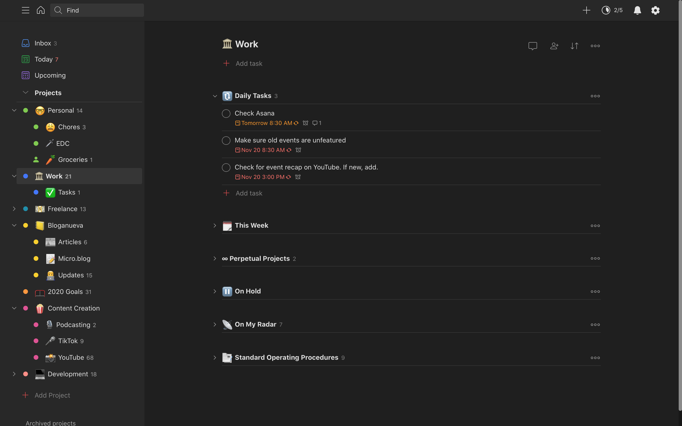
All Projects that use Boards have 3 Sections to denote task status: Not Started, In Progress, and Completed. This status simplicity really helps to motivate me. Boards allows dragging tasks between columns, and I find that this small difference is more satisfying than clicking the checkbox. For my own task management, I find the little things (Rule #32) really help my general outlook towards everything I have to do.
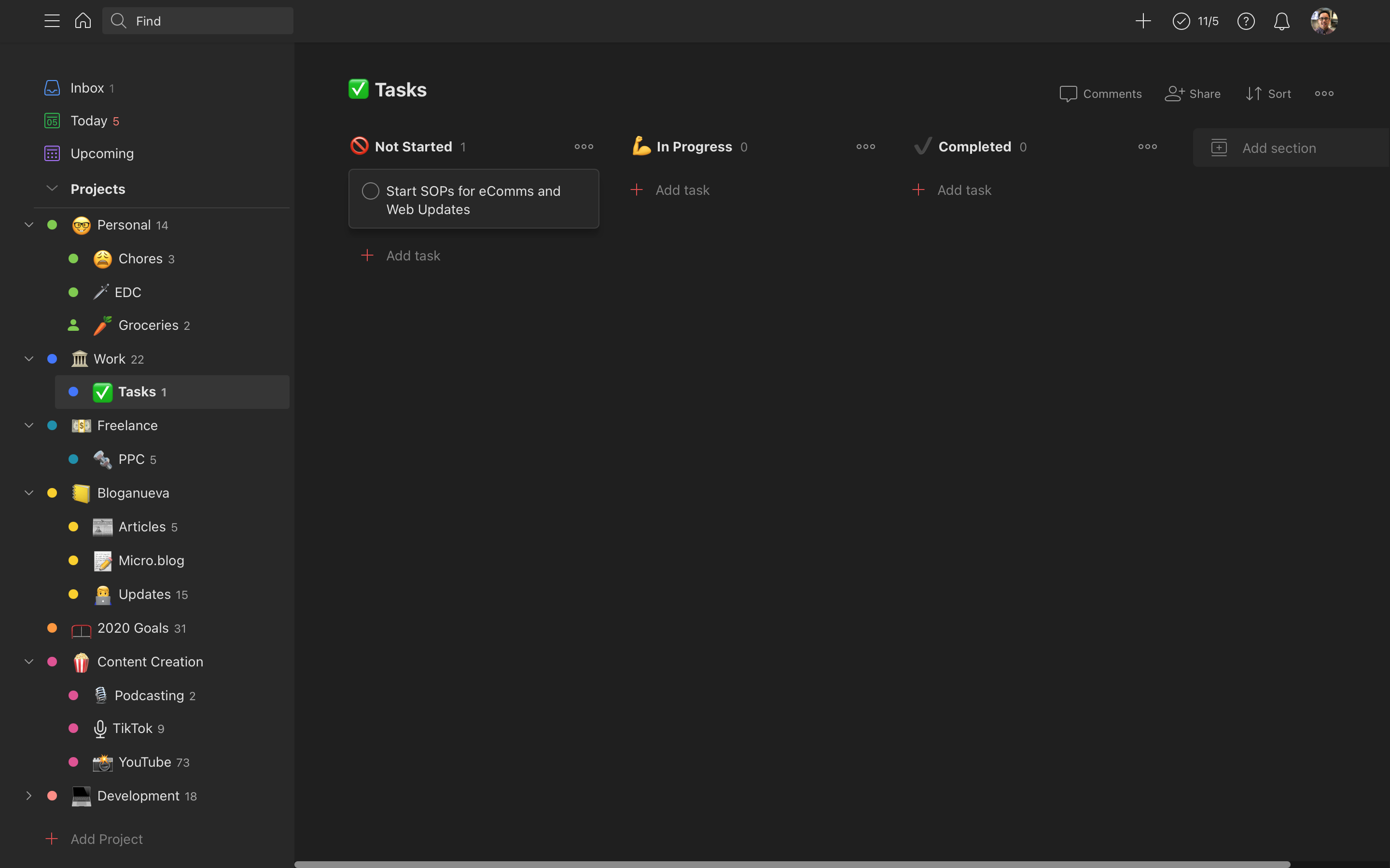
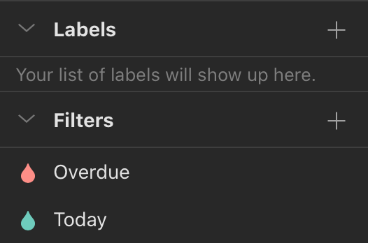
I now have no Labels and only 2 Filters. I created these 2 because I use them in 2 of my Todoist Widgets in iOS 14. One just displays Overdue items. The other displays only Today’s tasks. I liked the separation of these because even though I may have finished Today’s tasks, I don’t want to forget what’s overdue from Yesterday or days before. This works vice versa. It’s a good reminder for myself when I want to just quickly glance at my phone to see what else I need to do.
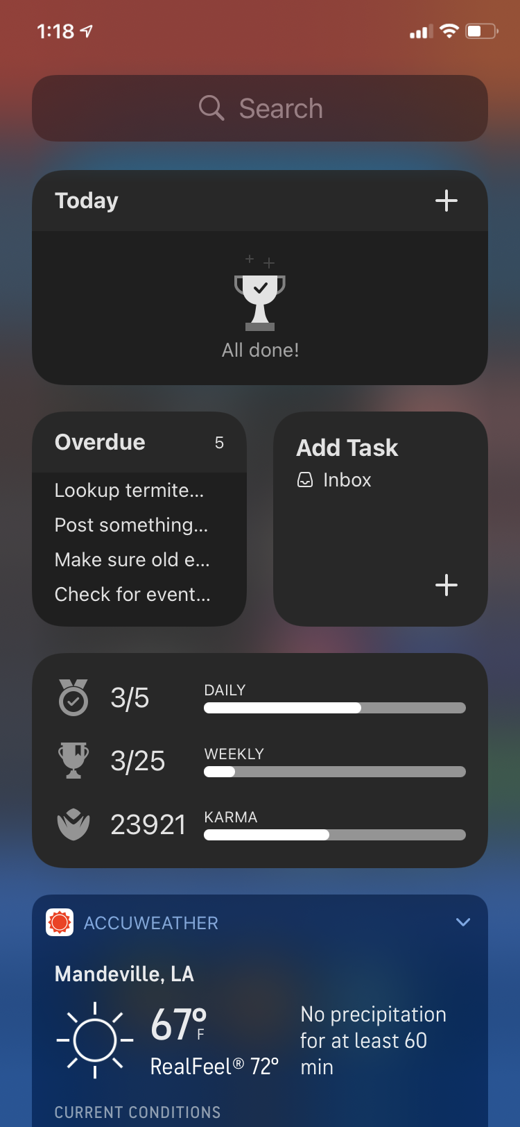
I added Emoji to the beginning of each Project and each Section to add a little visual fun like I’ve seen done by others. I think that’s big for me to have it looking nice and sort of funny so that it’s not too “worky.” What it says to me is, “Yes you have tasks, but you’ll have a good time looking at how many you have.”
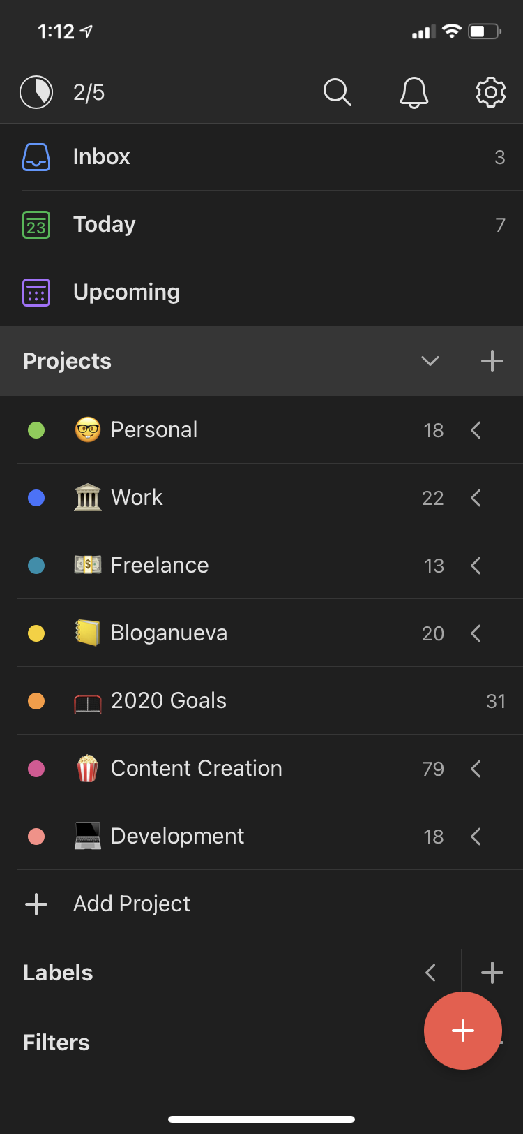
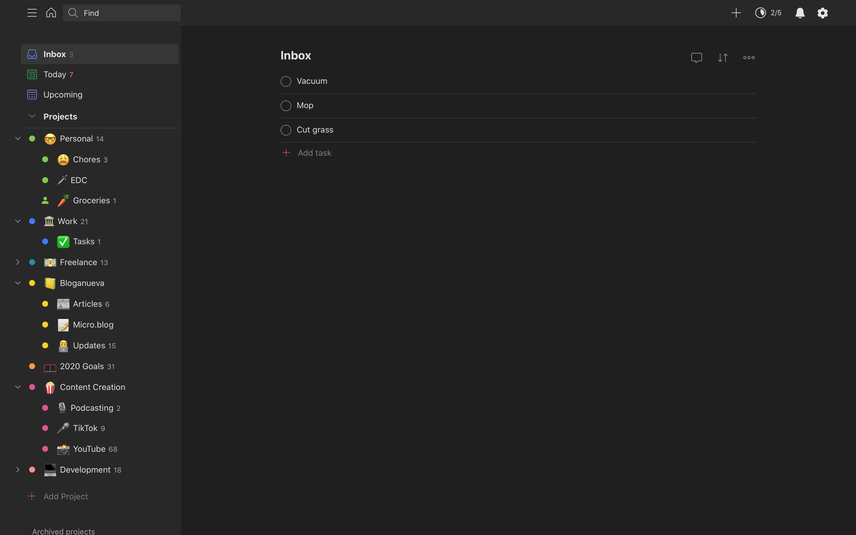
For quick tasks I would jot down in Drafts, I now put in my Inbox. In my old system I never put anything in my Inbox. I always thought it was a triage for tasks to categorize them later; but I thought to myself just categorize everything out the gate because the natural language processing makes it so easy. However, I now use Inbox as this quick task spot for tasks I don’t deem worthy enough of a Project.
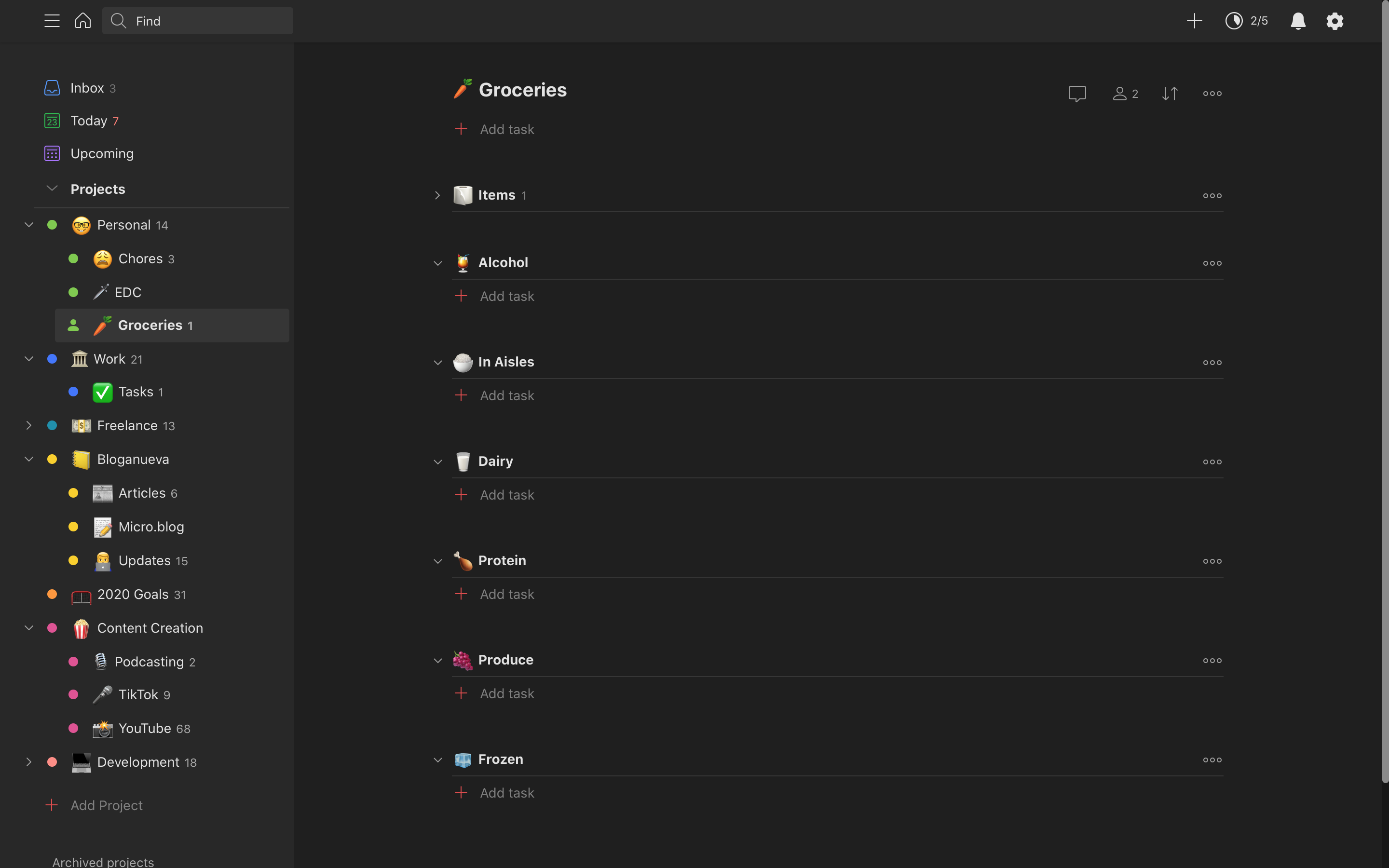
My groceries also live in Todoist now; it works great. I really like the categories we have because it helps navigating shopping a little easier when it’s already not one of my favorite things to do. The ability to drag items and Sections around to reorder is really nice too instead of cutting and pasting everything like I was doing before.
I think I’ve really found a sweet spot with this setup for myself. I’ve been using Todoist so much again, and more than that, actually enjoying it and not feeling dread. If you’re feeling overwhelmed, I recommend taking a step back and really assess your productivity system to see if anything can be improved. Just make sure you’re real with yourself so your new system will continue to work for you.
