Iterative Design
2017-10-19 04:20:58
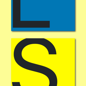
If you hadn't noticed I changed the look of my site already. I liked it, but deep down I knew I could make it better. I drew inspiration from two of my most used iOS apps, Todoist and Apple Notes. My favorite color is yellow, and I enjoy the two yellows of these apps. I also thought it'd be appropriate for my blog to look like some kind of notebook, a writing pad. I really liked this idea, and I'm very glad with how it's turning out so far. Sometimes you need to see something in order to know what needs to be changed. I've been making incremental changes to make sure one thing looks good before I move onto another one. I'm even more excited about my site now.
