I finally made a logo!
2018-01-06 20:09:58

I really like my site’s minimalist design. However, I couldn’t help but feel like something was missing. It occurred to me that I didn’t have a logo! I was thinking of ways to create it, and this is the story of how it all came together.
Explanation
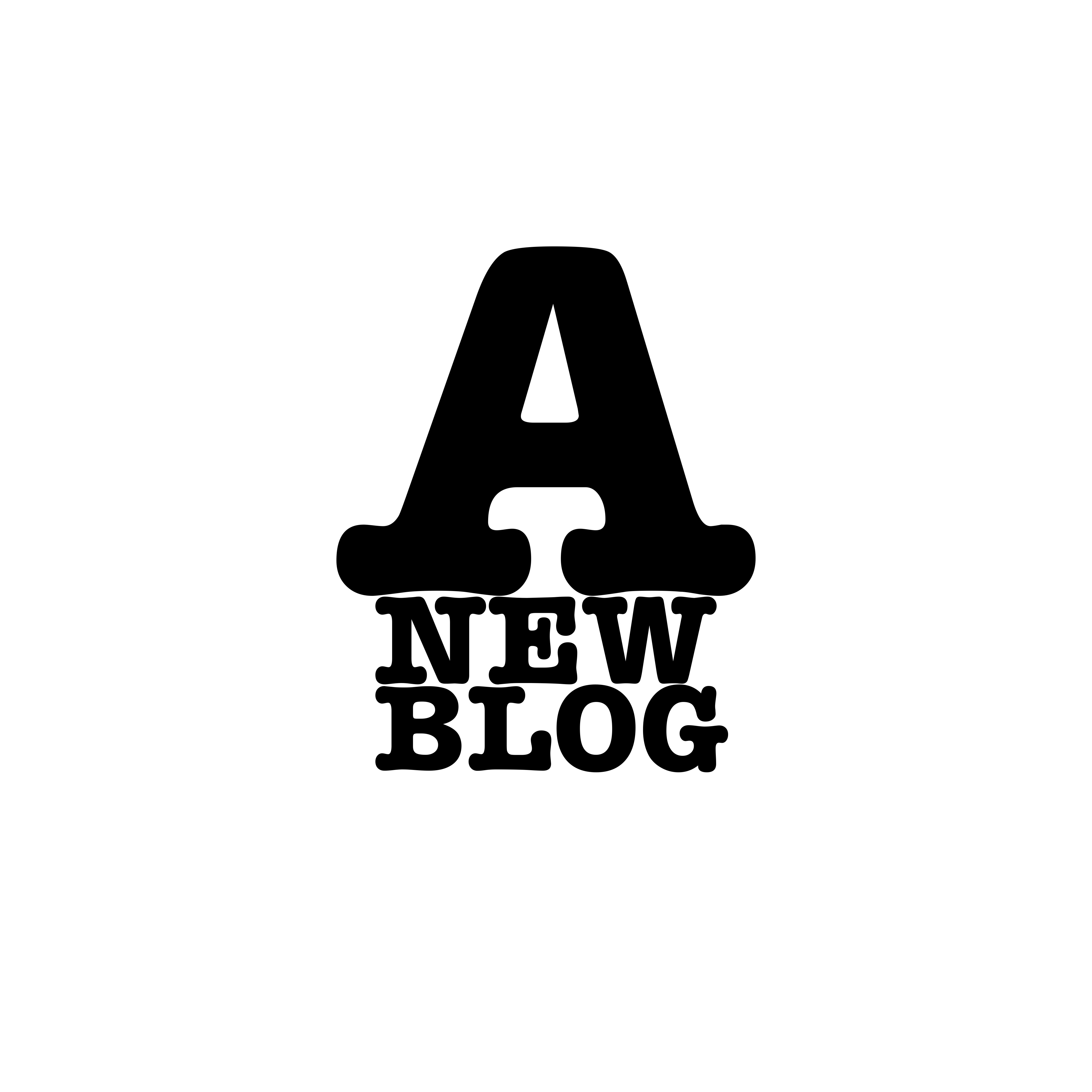
I’m Filipino, and my last name, Villanueva, translates to “a new house.” Bloganueva simply came from blog + (vill)anueva. I liked how it sounded the moment I thought of it. If you were to translate that, it would mean “a new blog.” I wanted my logo to be something involving a house because of my last name. I was able to work in a large part of my site’s design (the squares) to be the building blocks of the house. I think it just ties it all together. Plus, I replaced the A in Blog-A-Nueva; so I’m glad it kind of resembles an A.
Apps
I’m not a graphic designer, so Photoshop, Illustrator, etc. are not the most familiar programs. I did come up with my own way of doing it though. Disclaimer: I know this isn’t the most efficient way to do this.
The app I used to make the actual squares of the logo is Assembly. This is an art and design app I used a few other times. I decided to dust it off and utilize it again. Assembly’s learning curve is relatively low, so you get used to it pretty quickly. It has a lot of popups to let you know what you can do. I was able to make what I was seeing in my brain come to life pretty quickly with this app. I exported a transparent PNG and sent it to my MacBook to put it through GIMP.
I’m pretty familiar with GIMP. It’s basically an open-source Photoshop. I got into using it while I was using Linux, and I just decided take advantage of the knowledge I already had to not slow down the process just in case there was something I didn’t know how to do in Photoshop or Illustrator. I used GIMP’s to fill tool to fill in the colors of the squares with 2 of the colors from my site.
After this I used Photoshop to crop the png as close to the edges of the squares as I could.
Input and Iterations
I wanted my logo to be good, so I knew I’d want some feedback from people since my eye for design is still improving. I got just that from my boss Allen. Allen suggested I do a “sprint.” That’s a technique where you just draw out every possible idea you have, and you eventually narrow it down and meld parts from other designs until you come up with the right one. I did that, and it worked!
My thought for my logo was always centered around some kind of house. At first I wanted the house made of words.
I tried different fonts to make this idea work better, but it just wasn’t working out.
Then I tried the sprinting technique Allen suggested to me and came up with 9 squares. At this point, I didn’t think the house design was going to happen. I was going to leave it at that, but Allen suggested I just put a roof over it. At this moment something clicked, and I knew I had found my overall design! It was so exciting! He had suggested just something as simple as a triangle, but I wanted it to fit the overall motif. I put more squares to shape the roof, and this design brought me one step closer!

Originally I had one more row of squares at the bottom. Something didn’t look right. I looked like an arrow. I didn’t want to take them out because I wanted letters inside the squares spelling out “A NEW BLOG.” I decided against the letters in the end to keep the logo clean.
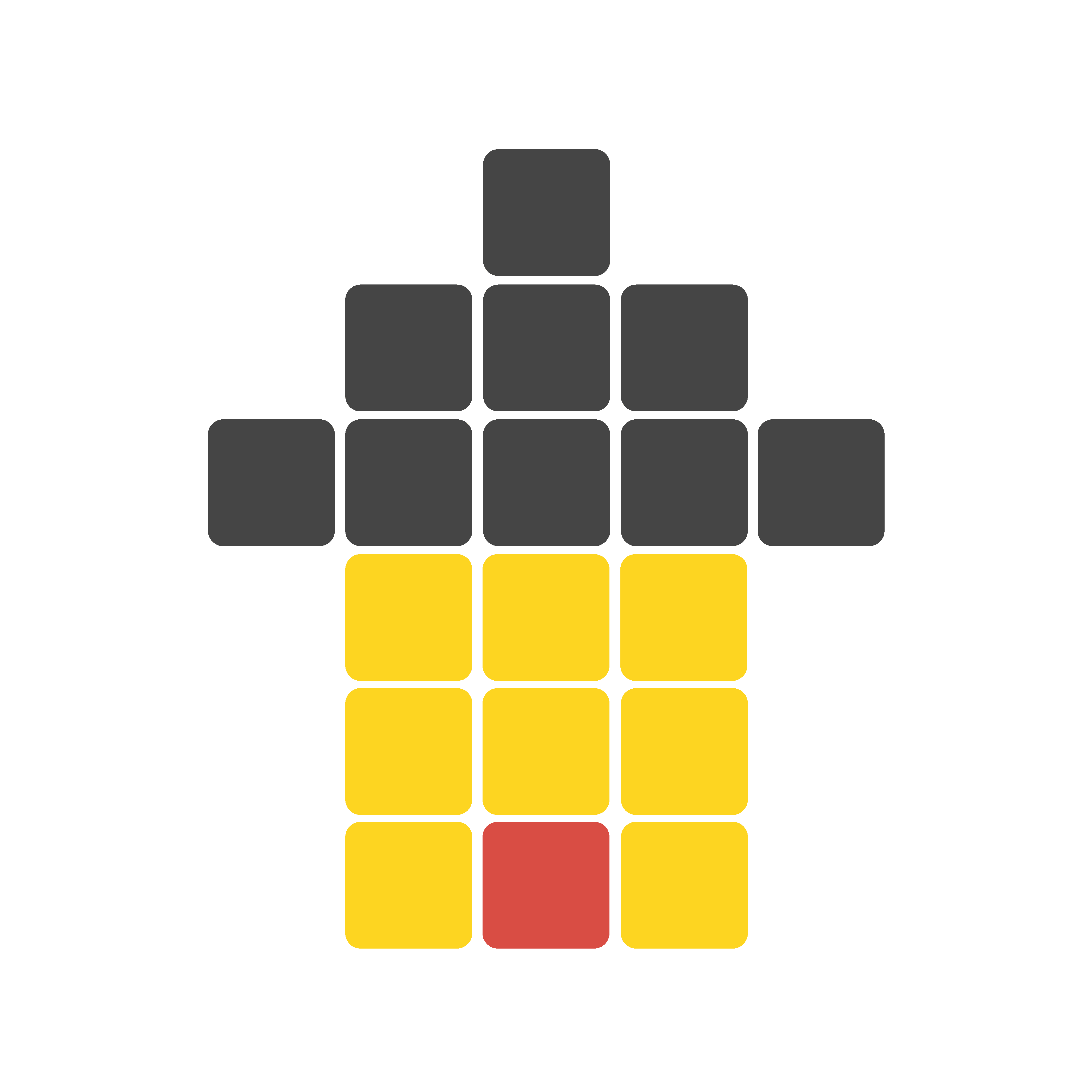
I also had a different color scheme, but I eventually picked out the current scheme.
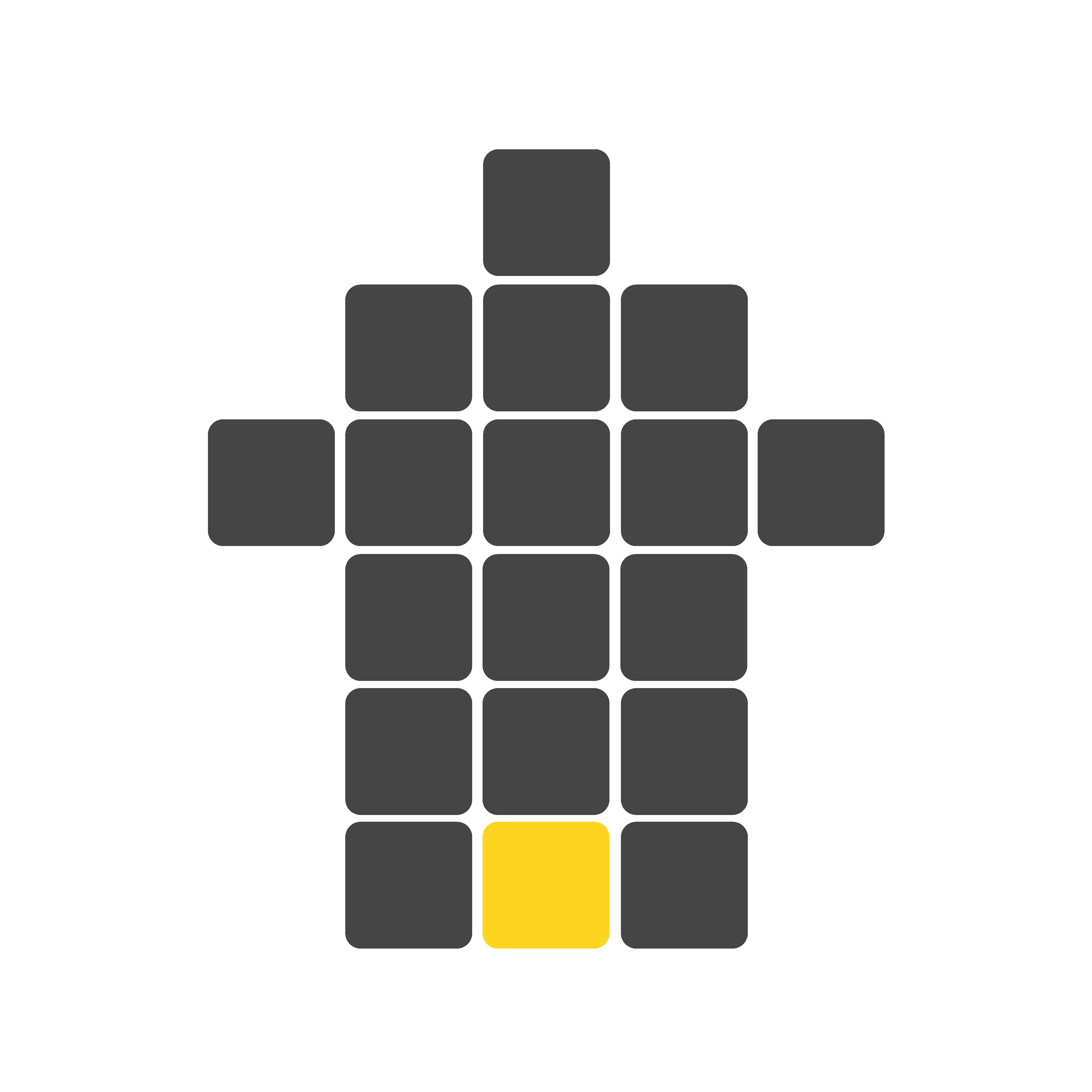
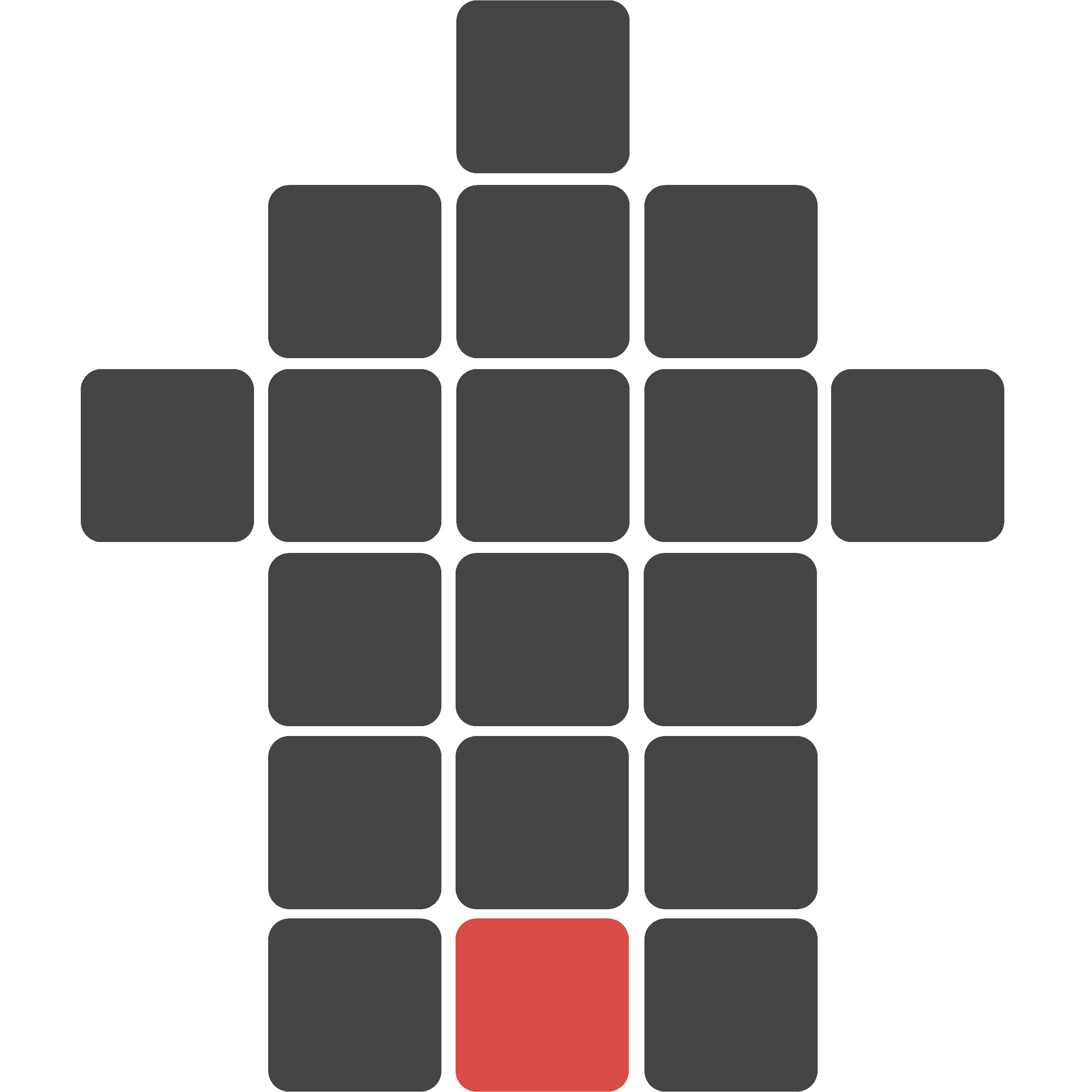
Allen said the same thing. He said it looked like an up vote. He suggested removing the bottom row as well and just move the colored square up one. I was a little reluctant, but I ultimately ended up doing this.

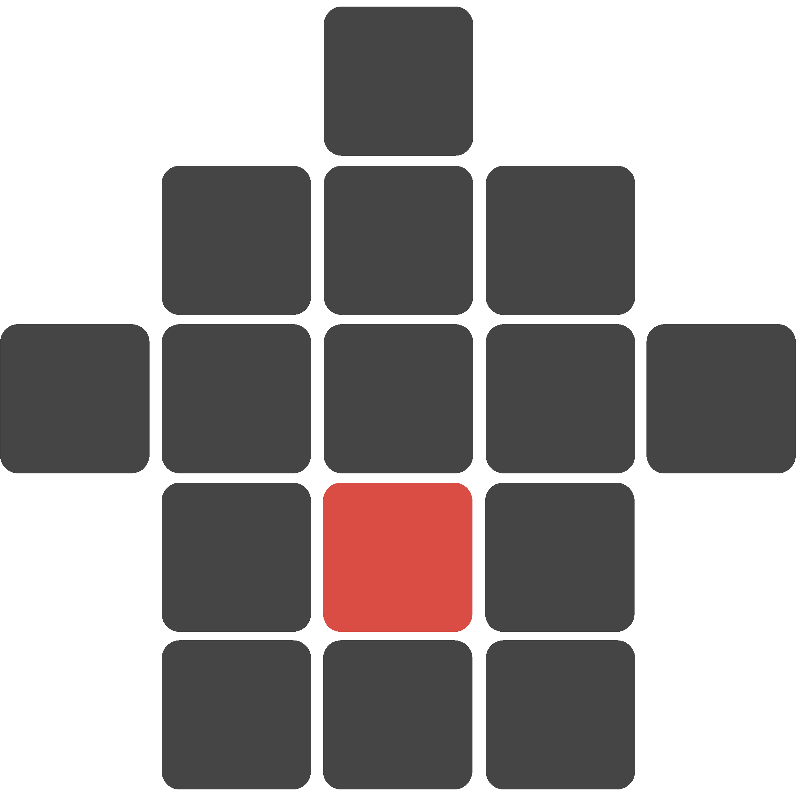
I’m so glad I did! Heeding their advice helped my original, lackluster designs blossom into my site’s beautiful logo. I’d like to thank Allen for helping me through this process!
I’m beyond satisfied with how the logo came out. It feels like this is what the it’s supposed to be. I couldn’t be happier!